
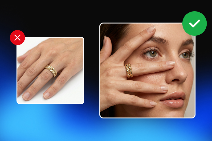
Some jewelry looks expensive before you even check the price.
You see the image, and something immediately feels refined. The metal looks clean. The stone catches the light naturally. The background supports the piece without fighting for attention. The shadows feel intentional. The color feels accurate. Nothing looks over-edited, plastic, or fake.
That premium feeling rarely comes from one thing. It is not just the camera. It is not just the background. It is not just a softbox, a marble surface, or a black velvet setup.
Premium jewelry photography is the result of control: control over light, control over reflections, control over color, control over background texture, and control over scale, composition, and consistency.
This is why jewelry is one of the hardest product categories to photograph well. A ring, necklace, bracelet, or pair of earrings may be physically small, but visually complex. Metals reflect everything around them. Diamonds need sparkle without looking artificial. Colored gemstones need accurate color. Pearls need softness. Gold needs warmth. Silver needs clean reflection control.
For e-commerce brands, the challenge is even bigger. One beautiful campaign image is not enough. A jewelry brand needs product page visuals, close-ups, lifestyle images, ads, social content, seasonal campaigns, and marketplace-ready images that all feel like they belong to the same brand.
This guide explains how lighting and background styles work together to make jewelry visuals feel premium, trustworthy, and commercially useful.
Premium Is a Visual System, Not a Filter
A common mistake in jewelry photography is assuming that “premium” means using dark backgrounds, dramatic shadows, marble surfaces, velvet fabrics, and golden reflections. Those elements can work, but they do not automatically create luxury.
A black background can make jewelry look elegant, but it can also hide detail. Marble can feel refined, but it can also distract from a delicate piece. Velvet can communicate softness and tradition, but it can look dated if the lighting is poor. A dramatic spotlight can create impact, but it can also produce harsh glare and inaccurate product representation.
Premium visuals are not created by adding expensive-looking props. They are created when every visual decision feels intentional.
A premium jewelry image answers several questions at once:
Does the product look accurate?
Can the customer understand the material, size, and finish?
Does the image match the brand’s price point?
Does the background support the product rather than compete with it?
Would this image feel consistent next to the rest of the collection?
Does it make the customer trust what they are seeing?
That last question matters most.
Jewelry purchases are emotional, but they are also trust-based. Customers cannot touch the metal, inspect the stone, or try the piece on before buying. The image has to do much of that work. It needs to communicate beauty, quality, scale, material, and authenticity in a few seconds.
That is why lighting and background choices are not just creative decisions. They are conversion decisions.
Why Jewelry Is So Difficult to Light
Jewelry is harder to photograph than many other products because it reacts strongly to light.
A ceramic mug absorbs light in a relatively predictable way. A cotton shirt shows texture without reflecting the entire room. A wooden chair has shape, grain, and surface detail that can be controlled with standard product lighting.
Jewelry behaves differently.
Polished gold and silver act almost like mirrors. They reflect the camera, the photographer, the studio, the light source, and sometimes even the background color. Diamonds and gemstones bend, reflect, and refract light. Small scratches, dust, and fingerprints become highly visible in close-up shots. A tiny change in lighting direction can completely change how expensive or cheap the piece looks.
This is why simply saying “use soft light” is not enough.
Soft light helps, but different materials need different treatment. Gold, silver, diamonds, colored gemstones, and pearls should not always be lit in exactly the same way.
The goal is not to remove all reflections. Jewelry needs reflections to show shape, shine, and material quality. The goal is to control reflections so they look clean, intentional, and flattering.
Bad lighting creates problems such as:
Harsh glare on polished metal
Flat-looking diamonds with no sparkle
Gold that appears too yellow, green, or dull
Silver that looks gray and lifeless
Pearls that lose their soft glow
Gemstones with inaccurate color
Distracting shadows that make the image feel cheap
Overexposed highlights that remove product detail
Good jewelry photography lighting solves these problems without making the image feel artificial.
The Lighting Styles That Make Jewelry Feel Premium
There is no single best lighting setup for jewelry photography. The right setup depends on the product, the material, the brand style, and the purpose of the image.
A clean e-commerce product page needs clarity. A luxury campaign image needs mood. A diamond close-up needs sparkle. A handmade jewelry brand may need warmth and texture.
The best lighting style is the one that supports the commercial goal of the image.
Soft Diffused Light
Soft diffused light is one of the most reliable lighting styles for jewelry product photography. It reduces harsh reflections, softens shadows, and helps polished surfaces look clean. This is especially useful for product pages, catalog images, marketplace listings, and close-up shots where the customer needs to clearly understand the piece.
Soft diffused lighting works well for:
Minimal rings
Gold bands
Earrings
Bracelets
Flat lays
Clean e-commerce images
Fine jewelry with polished surfaces
The biggest advantage of diffused light is control. It creates smooth transitions across metal surfaces instead of sharp white spots. This makes the jewelry look refined and easier to read.
However, too much diffusion can make jewelry look flat. Diamonds may lose sparkle. Silver can appear dull. The product may look technically clean but emotionally uninteresting.
That is why many high-end jewelry images use a soft base light combined with a more controlled accent light.
Directional Light
Directional light creates stronger shape, shadow, and contrast. It can make jewelry feel more sculptural and editorial. Instead of lighting the entire piece evenly, directional lighting highlights specific edges, curves, stones, or textures.
This style works well for:
Statement rings
Bold earrings
Luxury campaign visuals
High-end necklaces
Editorial product photography
Jewelry with interesting shapes
Directional light can create a stronger premium feeling because it adds drama and depth. But it must be controlled carefully. If the light is too harsh, the jewelry can look cheap, overexposed, or difficult to understand.
The key is balance. Directional light should define the piece, not attack it.
Natural Window-Style Light
Natural-looking light can make jewelry feel softer, more intimate, and more lifestyle-oriented. This does not always mean using actual sunlight. In many professional setups, window-style lighting is recreated with large soft light sources that imitate daylight.
This style is especially effective for:
Handmade jewelry
Everyday fine jewelry
Minimal gold pieces
Pearls
Lifestyle images
Soft luxury brands
Organic or artisanal collections
Window-style lighting works because it feels familiar. It suggests real life rather than a sterile studio. For brands that want to feel warm, elegant, and approachable, this can be more effective than dramatic studio lighting.
The risk is inconsistency. Real natural light changes throughout the day. Color temperature shifts. Shadows move. If a brand needs a consistent catalog, natural light must be managed carefully or recreated in a controlled environment.
Dark and Dramatic Lighting
Dark lighting can create a strong luxury mood, especially when paired with black, charcoal, deep green, navy, or burgundy backgrounds.
This style works best when the jewelry has enough reflective quality to stand out from the background. Diamonds, polished metals, and statement pieces can look powerful in darker scenes.
Dark and dramatic lighting works well for:
Diamond jewelry
Luxury rings
Statement earrings
Evening collections
High-end campaign visuals
Premium social media ads
But dark does not automatically mean premium.
If the lighting is poorly controlled, the product can disappear. Details can become unclear. The background can overpower the jewelry. For e-commerce, dark images should usually be used as supporting visuals rather than the only product image.
A customer still needs clear product information.
Mixed Lighting for Gemstone Sparkle
Gemstones often need a more nuanced lighting approach.
A fully diffused setup may show the shape clearly, but it can reduce brilliance. A fully direct setup may create sparkle, but it can also cause harsh glare and inaccurate color.
For diamonds and transparent gemstones, a combination of diffused base light and controlled direct accent light often works better. The diffused light keeps the product readable, while the accent light creates sparkle, fire, and dimension.
This approach is especially useful for:
Diamonds
Sapphires
Emeralds
Rubies
Transparent gemstones
Engagement rings
High-value close-ups
The goal is not fake sparkle. The goal is believable brilliance.
When sparkle looks too artificial, customers may lose trust. Premium jewelry visuals should enhance the natural qualities of the piece, not exaggerate them beyond recognition.
Different Materials Need Different Light
One of the biggest mistakes in jewelry photography is treating every piece the same.
A gold ring, a silver bracelet, a diamond engagement ring, a pearl necklace, and a colored gemstone pendant all interact with light differently. Premium jewelry photography starts with understanding the material.
Gold
Gold needs warmth, but not excessive yellow saturation.
If the white balance is too cool, gold can look pale or lifeless. If the image is too warm, the product can look orange, cheap, or inaccurate.
For gold jewelry, soft diffused lighting usually works well, especially when paired with warm neutral backgrounds such as ivory, beige, cream, stone, or soft gray. These backgrounds support the warmth of the metal without overpowering it.
Gold also benefits from controlled highlights. A clean highlight can show polish and curvature. Too many highlights can make the surface look messy.
Best background directions for gold:
Warm beige
Ivory
Soft white
Natural stone
Light gray
Deep green for editorial luxury
Charcoal for dramatic contrast
Silver and White Gold
Silver and white gold are more reflection-sensitive than many brands expect.
Because these metals are cooler and mirror-like, they easily reflect unwanted colors from the room, background, or camera setup. Poor lighting can make silver look gray, flat, or dirty.
Silver often needs broad, clean reflections rather than tiny sharp highlights. Large diffused light sources, white cards, and controlled reflection surfaces can help create smooth gradients across the metal.
Best background directions for silver:
White
Light gray
Cool beige
Charcoal
Black
Soft blue-gray
Minimal gradient backgrounds
Silver can look extremely premium on black or charcoal backgrounds, but the product outline must remain clear.
Diamonds
Diamonds need both clarity and sparkle.
If the light is too soft and even, the diamond may look clean but lifeless. If the light is too harsh, the stone may produce distracting glare or blown-out highlights.
The best diamond photography often uses a controlled combination of soft light and small accent highlights. This allows the stone to show brilliance without making the image look fake.
Best background directions for diamonds:
White or off-white for clarity
Black for drama
Charcoal for high-end contrast
Soft gray for balance
Minimal reflective surfaces for premium close-ups
The main risk with diamond photography is over-editing. If every stone looks unrealistically bright, the customer may question whether the product image is accurate.
Colored Gemstones
Colored gemstones require careful color control.
The background should not distort the stone’s color or compete with it. A green emerald, blue sapphire, or red ruby already carries strong visual weight. The background should support that color, not fight it.
For colored gemstones, neutral backgrounds are often safest for product pages. Editorial images can use complementary or tonal backgrounds, but the color relationship must be intentional.
Best background directions for gemstones:
Soft gray
Ivory
Neutral beige
Charcoal
Muted complementary colors
Stone textures
Minimal gradients
The most important rule is color accuracy. If the gemstone looks more saturated in the photo than it does in real life, the image may increase returns and reduce trust.
Pearls
Pearls need softness.
They do not benefit from harsh lighting in the same way diamonds might. A pearl’s beauty comes from subtle luster, gentle highlights, and smooth tonal transitions.
Large soft light sources work well for pearls. Warm neutral backgrounds, linen textures, soft beige, ivory, and gentle shadows can create a refined look.
Best background directions for pearls:
Ivory
Cream
Soft beige
Linen
Warm gray
Light stone
Muted pastel tones
Pearls can look cheap if the lighting is too harsh or the background is too glossy. The image should feel calm, soft, and elegant.
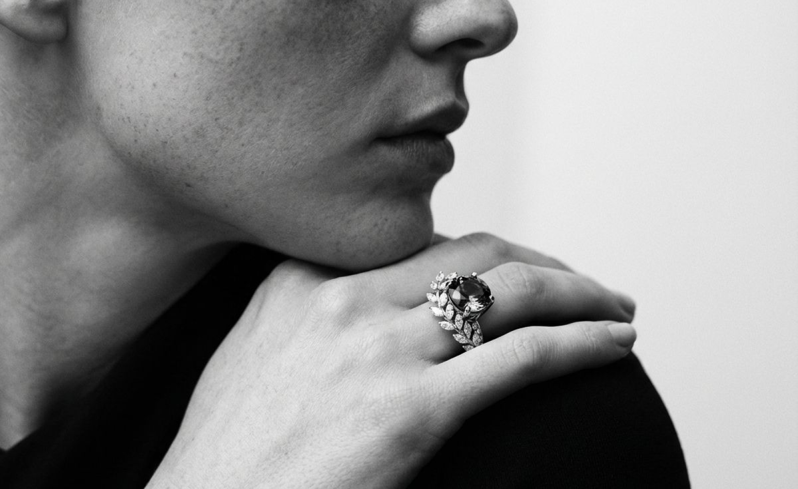
Background Styles and What They Communicate
The best background for jewelry photography depends on the purpose of the image.
A product page image, an Instagram campaign image, and a seasonal ad do not need the same background. They serve different jobs.
Instead of asking, “What is the best background for jewelry photography?” a better question is:
What should this image communicate?
White and Off-White Backgrounds
White backgrounds communicate clarity, cleanliness, and product focus.
They are especially useful for e-commerce jewelry photography because they remove distractions. Customers can see the product, compare pieces, and understand details more easily.
White backgrounds work well for:
Product pages
Marketplace listings
Catalog images
Minimal jewelry
Clean brand identities
Comparison views
However, pure white can sometimes feel too clinical. For premium jewelry, off-white, ivory, or very light warm gray can feel softer and more refined.
A common mistake is making the jewelry look like it is floating in empty space. A subtle contact shadow or controlled reflection can help ground the piece and make the image feel more real.
White does not have to mean cheap. When handled well, it can feel elegant, modern, and highly premium.
Beige and Warm Neutrals
Beige, cream, sand, and warm stone backgrounds are popular in modern luxury jewelry photography because they feel calm, expensive, and understated.
They work especially well for gold, pearls, handmade jewelry, and minimalist collections.
Warm neutrals communicate:
Soft luxury
Approachability
Natural elegance
Quiet confidence
Timelessness
These backgrounds are ideal for brands that want to avoid overly dramatic luxury clichés. They make the product feel premium without shouting.
The risk is low contrast. If the jewelry and background are too close in tone, the product can lose definition. Lighting must create enough separation.
Black and Charcoal Backgrounds
Black and charcoal backgrounds create drama, contrast, and a strong luxury mood.
They can make diamonds sparkle, silver feel sharper, and statement pieces look more powerful. These backgrounds are often effective for campaign visuals, hero images, and premium ads.
Black and charcoal communicate:
Exclusivity
Drama
Luxury
Evening elegance
High contrast
Boldness
But they are not always ideal for product clarity.
Small jewelry can disappear on dark backgrounds if the lighting is weak. Gold can look overly yellow. Silver can pick up harsh reflections. Shadows can become too heavy.
Dark backgrounds work best when used intentionally, not automatically.
Marble and Stone
Marble and stone backgrounds create a tactile premium feeling.
They suggest permanence, craftsmanship, and material quality. Stone surfaces work especially well for fine jewelry, gold pieces, artisan collections, and editorial product visuals.
Stone backgrounds communicate:
Craft
Luxury
Texture
Stability
Natural refinement
The key is subtlety. If the stone pattern is too strong, it can compete with the jewelry. The background should add texture without becoming the subject.
Soft stone, limestone, travertine, and muted marble often work better than highly dramatic marble patterns.
Velvet and Fabric
Velvet has a long association with jewelry presentation. It communicates softness, tradition, and luxury.
It can work beautifully for rings, necklaces, and heirloom-style pieces. Dark velvet can create a rich editorial mood, while lighter fabrics can feel soft and bridal.
Fabric backgrounds communicate:
Softness
Craft
Romance
Tradition
Tactility
The risk is that velvet can look old-fashioned if the styling is too heavy. Dust and lint can also become visible in macro photography.
Fabric should be clean, intentional, and aligned with the brand’s visual identity.
Colored and Gradient Backgrounds
Colored and gradient backgrounds can make jewelry photography feel more modern and campaign-ready.
Muted pastels, tonal color blocks, and soft gradients can create a fashion-forward look without overwhelming the product.
These backgrounds work well for:
Social media campaigns
Seasonal collections
Modern jewelry brands
Editorial visuals
Ads
Email campaigns
Color should be used carefully. The background must support the jewelry’s material and gemstone color. A background that looks beautiful on its own may still be wrong for the product.
For premium results, choose colors that feel intentional rather than trendy for the sake of trendiness.
Natural and Organic Textures
Wood, linen, handmade paper, sand, raw stone, and organic surfaces can make jewelry feel grounded and human.
These backgrounds are especially effective for handmade jewelry, artisanal brands, sustainable collections, and softer lifestyle imagery.
Natural textures communicate:
Craftsmanship
Warmth
Authenticity
Organic beauty
Handmade quality
The main risk is visual clutter. Texture should support the product, not distract from it. In premium jewelry photography, restraint matters.
How Lighting and Backgrounds Work Together
Lighting and background should not be chosen separately.
A background that looks premium under one lighting setup may look cheap under another. A black background with flat lighting may feel dull. A beige background with beautiful soft shadows may feel luxurious. A marble surface with harsh reflections may look messy, while the same marble with controlled light may look refined.
The best jewelry visuals come from matching the visual goal, lighting style, and background style.
Visual GoalLighting StyleBackground StyleBest ForClean e-commerceSoft diffused lightWhite, off-white, light grayProduct pages and catalog imagesQuiet luxuryLarge soft lightWarm beige, ivory, stoneFine gold jewelry and minimalist collectionsDramatic luxuryControlled directional lightBlack, charcoal, deep tonesDiamonds and statement piecesEditorial fashionDirectional or mixed lightingColor blocks, gradients, sculptural surfacesCampaigns and social adsOrganic premiumWindow-style soft lightLinen, wood, raw stone, handmade paperHandmade and artisanal jewelryHigh sparkleDiffused base light + accent lightNeutral or dark controlled backgroundDiamonds and transparent gemstones
This is where many jewelry images fail.
The background might be beautiful. The lighting might be technically correct. But together, they do not support the same goal.
Premium jewelry photography feels cohesive. Every element points in the same direction.
What Makes Jewelry Visuals Look Cheap
Most cheap-looking jewelry images fail because of small details.
The product itself may be beautiful, but the image creates doubt.
Common mistakes include:
Harsh reflections that hide the product shape
Dust, fingerprints, or scratches visible in close-up
Overexposed metal highlights
Backgrounds that overpower the jewelry
Fake-looking sparkle effects
Inaccurate gold or gemstone color
Flat lighting with no dimension
Heavy shadows that reduce clarity
Over-smoothing or excessive retouching
Inconsistent image styles across the catalog
Low-resolution crops
Poor scale representation
Too many props around a small product
The most dangerous mistake is over-editing.
Customers are more visually aware than many brands assume. If a diamond looks too perfect, if the gold color looks unrealistic, or if the background feels obviously artificial, the image may reduce trust instead of increasing desire.
Premium does not mean flawless in a fake way.
Premium means controlled, clear, beautiful, and believable.
Product Page Visuals vs. Campaign Visuals
A jewelry brand does not need one image style. It needs a visual system.
Product page visuals and campaign visuals have different jobs.
Product page images should help the customer evaluate the item. They need to show shape, material, scale, clasp details, stone setting, finish, and wearability. Clean backgrounds, controlled lighting, and accurate color are essential.
Campaign visuals should create desire. They can be moodier, more editorial, more seasonal, and more emotional. They can use darker backgrounds, richer textures, models, props, and creative lighting.
The mistake is treating these two image types as competitors.
A white background image is not less premium than an editorial image. It simply serves a different purpose.
A strong jewelry listing often includes:
A clean main product image
A close-up detail shot
A scale or model image
A lifestyle image
A material or texture close-up
A campaign-style visual
A packaging or gift-ready image
A short video or motion visual
This complete set gives customers both clarity and emotion.
That combination is what sells.
How to Build a Consistent Jewelry Visual System
Consistency is one of the strongest signals of a premium brand.
A single beautiful image can attract attention. A consistent visual system builds trust.
When a customer browses a jewelry website, every image should feel like it belongs to the same brand. This does not mean every image should look identical. It means the lighting, background logic, composition, color palette, and level of polish should feel connected.
A premium jewelry visual system defines:
Preferred lighting styles
Approved background types
Color palette
Shadow style
Reflection style
Model styling
Cropping rules
Product angles
Close-up standards
Campaign image direction
Marketplace image requirements
Social media visual language
For example, a minimalist gold jewelry brand might use warm beige backgrounds, soft shadows, natural light, and close-up lifestyle crops.
A high-end diamond brand might use clean white product images, dark editorial campaign visuals, precise reflections, and controlled sparkle.
A handmade jewelry brand might use linen, stone, wood, window-style light, and softer compositions.
The goal is not repetition. The goal is recognition.
Customers should be able to see a visual and feel that it belongs to your brand before they even see the logo.
Creating More Jewelry Visuals Without Rebuilding the Shoot
Traditional jewelry photography can be slow and expensive.
Every new background, campaign concept, seasonal visual, or format often requires more planning, styling, editing, and production time. For small teams, this creates a problem: the brand needs more content, but the production workflow cannot keep up.
This is where AI-powered creative workflows are changing how jewelry brands produce visuals.
The real value is not simply generating one attractive image. The value is being able to take one product and explore multiple premium visual directions while keeping the product accurate and the brand consistent.
One ring can become:
A clean white e-commerce image
A warm stone luxury scene
A dark editorial campaign visual
A soft natural lifestyle composition
A seasonal gift campaign image
A social media ad variation
A short motion visual
A premium visual identity should be consistent, but it does not have to be visually repetitive.
This is the kind of workflow Adject is designed for. Instead of treating each image as a separate one-off output, Adject gives brands a creative workspace where products, assets, edits, variations, and project context can stay connected. That matters for jewelry brands because consistency is not just about making one image look good. It is about scaling a visual direction across product pages, campaigns, ads, and social content.
AI is most useful when it expands a strong creative direction.
It should not replace taste, product accuracy, or brand control. It should help teams move faster while keeping those standards intact.
Final Thoughts: Premium Comes From Control
Premium jewelry photography is not about choosing the most expensive-looking background.
It is not always black velvet. It is not always marble. It is not always dramatic shadows. It is not always pure white.
Premium comes from control.
The light should reveal the material. The reflections should feel intentional. The background should support the product. The color should be accurate. The composition should feel refined. The full image set should feel consistent.
When these elements work together, jewelry looks more valuable, more trustworthy, and more desirable.
For e-commerce jewelry brands, that matters. Customers are not just buying metal and stones. They are buying confidence. They are buying emotion. They are buying the belief that what they see online will match what arrives in the box.
That belief starts with the visual.
And the strongest jewelry visuals are not just beautiful. They are clear, controlled, consistent, and commercially ready.

