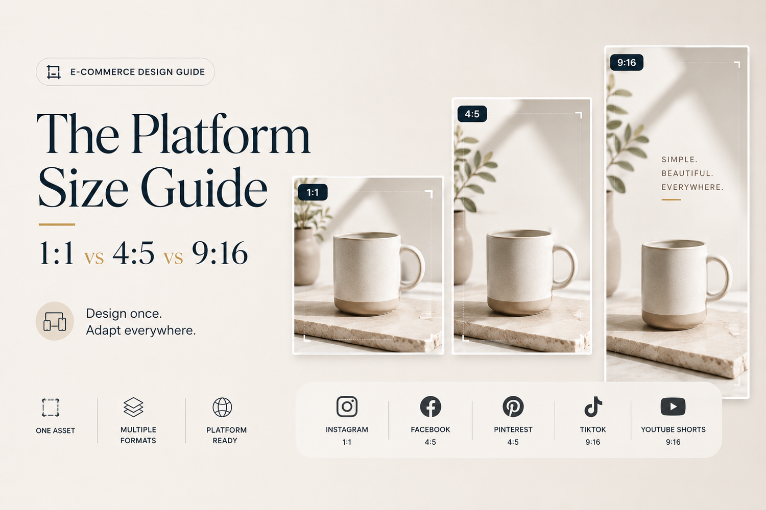
The Platform Size Guide: 1:1 vs 4:5 vs 9:16 (And What to Export)
There was a time when creating product images was surprisingly simple. A brand would organize a photoshoot, edit a handful of product photos, upload them to an online store, and maybe resize a few versions for social media. The images were considered “finished,” and that was the end of the creative process.
Today, that workflow feels almost outdated.
Modern e-commerce brands don’t publish products on a single website anymore. A customer might first discover a product through an Instagram Reel during their morning commute, see it again in a Facebook ad later that day, compare it on Shopify that evening, save it on Pinterest for inspiration, and finally return a week later after watching a TikTok creator use it.
The product hasn’t changed. The environment around it has.
Each platform has its own interface, its own user behavior, and its own way of displaying visual content. More importantly, each platform asks your images to do something different. On Shopify, your product image needs to answer questions. On Instagram, it needs to stop someone from scrolling. On TikTok, it has to compete with full-screen video. On Pinterest, it needs to inspire.
The mistake many brands make is assuming that one image can accomplish all of those jobs equally well. Technically, it can. Strategically, it usually can’t.
The Hidden Cost of “One Image Fits All”
Imagine you’ve just finished photographing a new ceramic coffee mug. The product photography looks fantastic. The lighting is soft, the colors are accurate, and the composition feels balanced. Everyone on the team loves the final image.
So naturally, you export it once and upload it everywhere. A square version goes to Shopify. The same square image is uploaded to Instagram. Later, it’s reused for Meta Ads. Eventually, someone crops it vertically for Stories.
Nothing seems wrong at first. Until you start looking closer.
On your website, the product feels clean and premium. Inside Instagram’s feed, it suddenly appears smaller than competing posts because it occupies less vertical space. When the platform automatically crops it for Stories, the handle sits awkwardly near the edge of the screen. The text overlay now covers part of the product because there wasn’t enough room left in the composition.
None of these issues are dramatic enough to make someone leave immediately. But together, they slowly reduce the quality of the shopping experience.
Customers rarely think, “This aspect ratio is incorrect.” Instead, they simply feel that another brand’s content looks more polished.
And perception matters.
Research in consumer behavior consistently shows that people form opinions about products within moments of seeing them. Before they read your product description, compare specifications, or check reviews, they’ve already started deciding whether your brand feels trustworthy. Visual presentation plays an enormous role in that first impression.
Aspect Ratios Aren’t Technical Settings — They’re Marketing Decisions
One of the biggest misconceptions in e-commerce is treating aspect ratios as purely technical requirements. In reality, they’re creative decisions.
Changing from a square image to a portrait image isn’t just changing dimensions. You’re changing how much attention the product receives. You’re changing how the customer’s eye moves through the image. You’re changing how much space the product occupies on a screen that’s already competing with hundreds of other pieces of content.
Think about walking into two different retail stores. One places its products on clean, spacious displays where every item has room to breathe. The other crams everything onto crowded shelves. Even if both stores sell exactly the same products, they don’t create the same shopping experience.
Digital commerce works in much the same way.
Aspect ratio influences visual breathing room. It influences hierarchy. And ultimately, it influences perception.
That’s why successful brands don’t ask, “Which size should we export?” They ask, “Where will customers discover this image first, and how can we make it feel native to that environment?”
That small shift in thinking completely changes how visual content is planned.
Every Platform Has Its Own Visual Language
One reason brands struggle with image sizing is because they assume every platform behaves the same way. It doesn’t.
Instagram is designed around immersion. The larger your content appears within the feed, the more likely people are to notice it while scrolling.
Shopify is different. Customers visiting your online store already have buying intent. They aren’t looking for entertainment; they’re evaluating products. Here, clarity often matters more than occupying additional screen space.
Pinterest behaves differently again. Users browse collections of ideas rather than individual products. Images need enough vertical presence to stand out, but they also need enough context to communicate inspiration rather than simply displaying an object.
TikTok introduces another layer entirely. Here, visual content isn’t competing against static images. It’s competing against motion.
A product image designed for TikTok isn’t simply taller. It needs to feel like it belongs inside a full-screen, mobile-first experience.
This is why the conversation shouldn’t start with dimensions. It should start with context. Because dimensions only matter after you understand where and how people will actually experience your content.
The Truth About 1:1: Safe Doesn’t Always Mean Best
If you’ve worked in e-commerce for a while, chances are you’ve exported hundreds if not thousands of square product images.
There’s a good reason for that. For years, the square format became the unofficial standard across online stores because it was predictable. It looked clean in product grids, worked well on desktop, and was supported by nearly every marketplace. If a retailer asked for product photography, there was a good chance they expected a square image.
That hasn’t changed.
What has changed is where customers discover products.
A square image is excellent at organizing products inside a catalog. It’s far less effective at competing for attention inside a mobile feed. That’s an important distinction, because many brands confuse compatibility with performance.
Just because a platform accepts a square image doesn’t necessarily mean it’s the format that gives your content the greatest chance of being noticed.
Think of 1:1 as the universal language of e-commerce. It works almost everywhere. But speaking the local language usually works better.
If your product page, marketplace listing, or B2B catalog is the primary destination, a square image is still one of the safest choices you can make. It creates consistency across collections, keeps product grids balanced, and makes browsing feel organized.
Where brands run into trouble is treating the square image as the master version for every other channel. That’s where the workflow starts working against them.
Why 4:5 Quietly Became the Social Media Standard
If you compare Instagram feeds from five years ago with the feeds of premium brands today, you’ll notice a clear shift: less square, more vertical.
This didn’t happen because designers suddenly preferred portrait compositions. It happened because platforms reward visibility.
A 4:5 image naturally occupies more space on a mobile screen than a square image. As users scroll through their feed, a taller image simply remains visible for longer. That extra screen space might only represent a fraction of a second, but when people are making split-second decisions about what deserves their attention, fractions of a second matter.
Luxury brands understood this surprisingly early. Fashion houses, beauty companies, furniture brands, and jewelry retailers slowly moved toward taller compositions not because they wanted larger files, but because they wanted stronger visual presence.
Interestingly, nothing about the product itself changes. A gold ring remains exactly the same. A ceramic lamp doesn’t become more beautiful. The image simply gives the product more room to breathe.
That breathing room changes perception. Products feel less crowded. Materials become easier to appreciate. Negative space creates a stronger sense of premium design.
This is one reason why 4:5 has become such a popular format for storytelling. It gives both the product and the surrounding environment enough space to exist together naturally. For brands trying to build emotional connection not just display inventory that additional canvas is incredibly valuable.
Vertical Isn’t Just Another Crop
Perhaps the biggest misunderstanding around 9:16 is thinking of it as “the vertical version.”
It isn’t.
It’s an entirely different experience.
When someone opens TikTok or Instagram Reels, they’re no longer browsing products. They’re consuming stories. Everything on the screen is designed around immersion. The product isn’t sitting inside a grid anymore. It’s occupying nearly the entire display.
That changes everything about composition.
Where does the product sit? How much empty space should remain? Will subtitles appear later? Does the design leave enough room for buttons and interface elements?
A beautiful square image almost never answers those questions. Simply extending the canvas upward and downward doesn’t solve the problem either.
Good vertical content is designed vertically from the beginning.
That’s why the strongest brands rarely “convert” square assets into vertical ones. They rebuild the composition while preserving the same visual identity.
One Master Image Is Better Than Twenty Random Exports Design Once. Adapt Everywhere.
Many creative teams still organize content like this: one folder for Instagram, another for Shopify, another for Meta Ads, another for Amazon, another for email.
Over time, every campaign creates another set of duplicated files. Eventually, nobody knows which version is the latest.
Ironically, the problem isn’t exporting. It’s fragmentation.
The best creative teams have quietly moved toward a completely different workflow. Instead of thinking in exported files, they think in master assets.
The product itself becomes the source of truth. Every platform-specific version grows from that original asset.
Need a square marketplace image? Generate it. Need a vertical Story tomorrow? Create it from the same foundation. Need a 4:5 version for a seasonal campaign next month? No problem.
Nothing has to be rebuilt because the product, the composition, and the creative context are already connected.
This approach becomes even more valuable as product catalogs grow. Managing ten products is easy. Managing two thousand products across six marketing channels is an entirely different challenge.
That’s exactly why modern visual production is shifting away from folders full of exports and toward connected creative workspaces.
Instead of asking, “Which file should we use?”, teams increasingly ask, “Which asset should this version come from?”
It’s a subtle change in language. But it represents a completely different way of thinking about content creation.
The Biggest Mistake Isn’t Choosing the Wrong Size
By this point, you might be wondering, “So which format should we export first?”
Ironically, that’s probably the wrong question.
The biggest mistake brands make isn’t choosing between 1:1, 4:5, or 9:16. It’s treating exports as the final step of the creative process.
In reality, exports are simply different versions of the same visual idea.
Think about how most teams work today. A designer finishes a product image, exports six different sizes, saves them into six different folders, uploads each version to a different platform, and repeats the entire process every time a campaign changes.
Nothing about that workflow is creative. It’s administrative.
As product catalogs grow and marketing channels multiply, creative teams often spend more time resizing, organizing, and searching for files than they do actually designing better visuals.
The irony is that modern AI has made image generation dramatically faster, while many creative workflows still feel stuck in 2018.
Images have evolved. Production systems often haven’t.
The Future Isn’t More Images. It’s Fewer Bottlenecks.
One of the biggest misconceptions surrounding AI is that its primary purpose is generating more content.
Most brands don’t actually have a shortage of images. They have a shortage of efficient production.
Every campaign needs another export. Every social platform needs another crop. Every seasonal promotion creates another folder full of duplicated assets.
Eventually, creative production slows down not because people run out of ideas, but because the workflow itself becomes difficult to manage.
That’s why the conversation around AI is gradually changing.
A year ago, everyone wanted image generators. Today, more teams are asking for something different. They want systems that help them organize, adapt, reuse, and scale the content they already have.
Because creating the image is only one part of the job. Managing it afterwards is often the bigger challenge.
Design Once. Adapt Everywhere.
The Biggest Mistake Isn’t Choosing the Wrong Size
The most efficient creative teams don’t think in exports anymore. They think in systems.
Instead of designing separately for Shopify, Instagram, TikTok, Pinterest, Meta Ads, and email campaigns, they begin with one strong visual foundation that can evolve across every customer touchpoint.
The product remains consistent. The story changes.
A square composition becomes a marketplace listing. The same product becomes a taller editorial image for Instagram. Later, it evolves into a full-screen vertical creative for Stories or Reels.
The customer experiences each version differently, yet the brand still feels unmistakably familiar.
That’s the goal.
Not producing more images. Producing smarter ones.
Why Creative Workflows Are Becoming the Competitive Advantage
For years, competitive advantage came from having a better camera, a larger studio, or a bigger creative budget. Today, those things still matter but they’re no longer enough.
The brands growing fastest are often the ones that can move from an idea to a published campaign in hours instead of weeks.
They launch faster. They test more variations. They refresh creative more often. And because they learn faster, they improve faster.
That isn’t simply a technology advantage. It’s a workflow advantage.
As e-commerce becomes increasingly content-driven, the ability to continuously adapt visual assets across different platforms is becoming just as valuable as the original photography itself.
That’s exactly the philosophy behind Adject.
Rather than functioning as another AI image generator, Adject is designed as a creative workspace where products become reusable assets instead of one-off files. Images aren’t treated as finished exports they remain connected to projects, edits, and future variations, making it much easier to adapt content for Shopify, Instagram, TikTok, marketplaces, email campaigns, and every other channel without rebuilding the creative process from scratch.
For growing brands, that means spending less time managing files and more time creating work that actually moves the business forward.
Final Thoughts
The debate between 1:1, 4:5, and 9:16 isn’t really about aspect ratios. It’s about understanding context.
Every platform has its own way of presenting products, capturing attention, and guiding customers toward a purchase. The brands that consistently create strong visual experiences aren’t the ones exporting the most image sizes they’re the ones designing with the platform, the customer, and the entire journey in mind.
In 2026, successful e-commerce brands won’t ask, “Which size should we export?”
They’ll ask, “How can this product look native everywhere our customers discover it?”
That’s a much better question.
Because modern commerce is no longer built around individual images. It’s built around connected visual experiences.