

A product image can be technically perfect and still make a poor Meta ad. That is one of the most important distinctions ecommerce brands need to understand. The polished white-background photo that looks great on a product page may disappear in a busy Instagram Feed. A lifestyle image that performs well in Stories may become confusing when cropped into another placement. And an attention-grabbing creative can still hurt performance if the product looks different from what customers eventually see on the landing page.
Effective Meta Ads product image best practices are therefore about much more than resolution or Facebook ad image size. Strong ecommerce advertising combines product clarity, composition, realism, mobile-first formatting, brand consistency and continuous creative testing. The goal is simple: someone scrolling quickly should understand what you are selling, why it matters and whether it is relevant to them without having to study the image. This guide explains how ecommerce brands can create better product images for Facebook ads, Instagram ads and other Meta placements without turning every creative into an overdesigned banner.
Why Product Images Matter So Much in Meta Ads
Your product image often has to do its job before the copy gets a chance. People do not browse Facebook or Instagram with the same intent they have when searching an ecommerce store. They are moving through posts, videos, messages and recommendations. Your ad enters that environment as an interruption. That makes visual communication critical. A strong ecommerce ad creative should make the product immediately recognizable while giving the viewer a reason to stop. That does not necessarily mean using bright colors, enormous text or exaggerated graphics. In many categories, clarity is a stronger creative advantage than visual noise.
A useful way to evaluate a product image is to ask three questions:
Can I identify the product immediately?
Can I understand what makes this product interesting?
Does the image feel trustworthy enough to click?
If one of those answers is no, changing the audience targeting will not necessarily solve the creative problem. Good Meta ad creative best practices begin with making the product itself easy to understand.
Use the Right Meta Ad Image Size and Aspect Ratio
There is no single Facebook ad image size that is ideal for every placement. For ecommerce teams, aspect ratio is usually the more useful way to think about creative production because the same campaign can appear across Facebook Feed, Instagram Feed, Stories, Reels and other placements. For 2026, the core ratios remain straightforward:
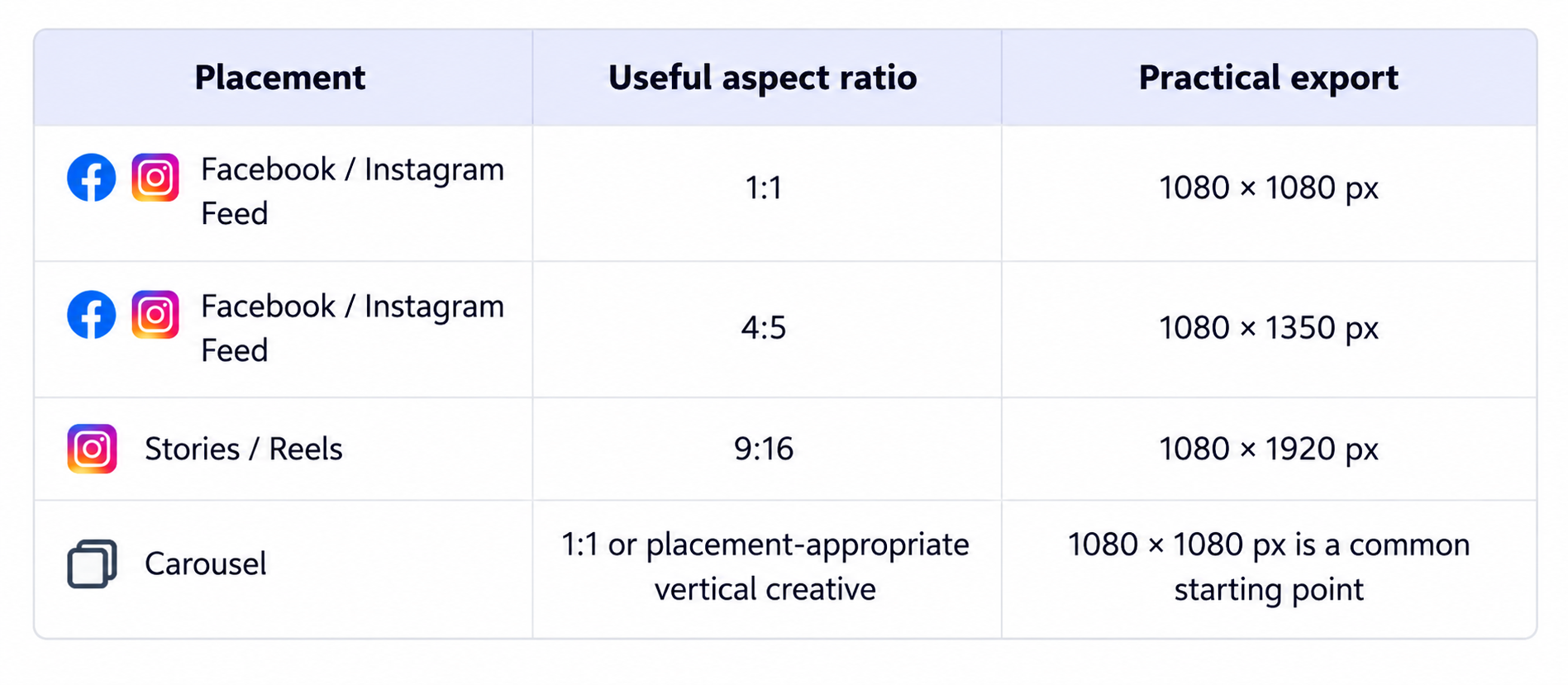
Current guides differ slightly on their preferred absolute resolutions—some recommend higher-resolution 1440-pixel exports—but consistently emphasize 1:1 and 4:5 for Feed and 9:16 for full-screen Stories and Reels. The practical lesson is to design around the placement and aspect ratio rather than obsessing over one universal pixel dimension.
1:1 vs. 4:5 Product Images for Meta Feed Ads
Should you use 1:1 or 4:5 for Facebook ads? Both are useful. A square 1:1 image is versatile and easy to reuse across placements. For brands managing a large volume of creatives, that flexibility can make production simpler. A 4:5 image, however, occupies more vertical space in a mobile Feed. That gives you additional visual real estate for the product and its surrounding context. Hootsuite's current 2026 specifications likewise highlight 4:5 as a strong mobile Feed format while retaining 1:1 as a versatile option.
That does not mean 4:5 automatically generates a higher CTR, lower CPA or better ROAS. Format is one variable. A compelling 1:1 image can easily outperform a weak 4:5 creative. The sensible approach is to create placement-appropriate versions and test them with comparable audiences and offers.
Use 9:16 Creative for Stories and Reels
Stories and Reels are full-screen, mobile-first environments. A 9:16 creative gives the product room to feel native to that experience instead of looking like a square Feed image dropped into a vertical canvas. But do not simply stretch or awkwardly crop your original product photo. Recompose it. Give the product enough visual presence and keep important details away from interface elements that may cover parts of the creative. Meta specifically recommends keeping key creative elements within the Reels safe zone and provides placement customization tools for adapting assets.
Think in terms of placement-specific composition, not just placement-specific resizing.
Make the Product the Clear Focal Point
One of the easiest ways to weaken an ecommerce ad is to make viewers search for the thing being sold. The product should normally be one of the first things the eye notices. That means your product photo composition needs hierarchy. Background props, models, typography, packaging, decorative graphics and environmental details can all support the product. They should not compete with it. Imagine an ad for a skincare bottle photographed on a bathroom counter. Towels, mirrors, plants and natural light may make the scene feel believable. But if the bottle occupies five percent of the frame while every prop receives equal visual emphasis, you have produced a lifestyle photograph—not necessarily an effective product ad.
The same principle applies to fashion, jewelry, furniture, electronics, cosmetics and food. Make the surrounding scene serve the product. A useful test is to view the image at approximately the size it will appear on a phone. If the main product becomes difficult to recognize, the composition probably needs work.
Lifestyle vs. Studio Product Images for Meta Ads
Should ecommerce brands use lifestyle images or studio product photography? Usually, both. The better question is what each creative needs to communicate.
When Studio Product Images Work Well
Studio product photography is useful when clarity is the priority. A clean or neutral background can help customers evaluate:
shape
color
materials
packaging
product details
variants
It is especially useful when the product itself has strong visual appeal or when shoppers need to understand exactly what they will receive. Studio images can also work well for retargeting and catalog-driven campaigns because there is little ambiguity about the item being advertised.
When Lifestyle Product Images Work Well
Lifestyle product photography adds context. Instead of showing only a lamp, you show the lamp inside a thoughtfully designed living room. Instead of displaying a handbag against a blank background, you show it carried naturally in an everyday setting. That context can answer questions that a studio photograph cannot easily answer: How big is it? How is it used? Who is it for? Where does it fit into someone's life? For that reason, lifestyle product photography for ecommerce ads is particularly useful when the setting itself communicates part of the product's value.
But lifestyle does not mean cluttered. The product still needs to remain identifiable.
White Background or Lifestyle Image for Ads?
There is no universal winner. A white-background product image can communicate clarity and purchase intent. A lifestyle creative can communicate context, aspiration or use. Test the distinction instead of debating it theoretically. For example, an ecommerce brand could run three creatives around the same product:
Creative A: clean studio image
Creative B: realistic lifestyle environment
Creative C: closer product-in-use composition
Keep the offer, landing page and major campaign variables as consistent as possible. The performance difference then becomes useful information about what your audience responds to.
Keep Product Images Realistic and Accurate
High-quality product images are not simply attractive. They should be believable. This becomes particularly important as AI product photography becomes part of ecommerce creative workflows. Customers should not click an ad showing one product and land on a page showing something noticeably different. Watch carefully for:
altered logos or labels
inaccurate product proportions
incorrect colors
invented buttons, seams or packaging details
warped typography
unrealistic reflections
impossible shadows
strange hands around handheld products
inconsistent materials or textures
These details matter because the purpose of advertising is not simply to generate attention. It is to create qualified interest in the product that is actually being sold. An image can therefore be visually impressive and commercially weak at the same time. The strongest realistic product photography preserves product identity while improving the context around it. If AI is being used to create the scene, the background, lighting or model can change dramatically—but the product should remain recognizable and accurate.
Avoid the “Too Perfect” Product Image Problem
Realism deserves another consideration. Sometimes an image is technically flawless but still feels artificial. The lighting is perfect. Every surface is spotless. Every object sits at an exact angle. Skin has no texture. Shadows look mathematically clean. Nothing in the scene feels accidental or lived-in. The result can look more like a 3D render than a photograph. For ecommerce advertising, realism often comes from small imperfections: natural fabric folds, believable reflections, subtle skin texture, realistic depth of field, uneven environmental light or ordinary objects positioned in ways that people actually use them.
This is particularly important for AI product photography for ecommerce. The objective should not be to create the most visually perfect image possible. It should be to create a convincing image that still keeps the product commercially clear.
Keep Text Overlays Simple
There is still a surprising amount of outdated advice online about Facebook's old 20% text rule.
Does Meta Still Have a 20% Text Rule for Ad Images?
No—not in the old form advertisers remember. Shopify's May 2026 Facebook ads guide notes that there is no fixed limit on how much text can be included in an image ad. It also notes Meta's recommendation to keep images uncluttered and to maintain a clear focal point. That is a much better principle to follow than calculating the percentage of pixels covered by typography. Text can be useful when it communicates something the image cannot communicate quickly enough, such as:
“New”
“30% Off”
“Waterproof”
“Made for Sensitive Skin”
But once your graphic contains a headline, subheadline, discount badge, testimonial, five product benefits, CTA, logo and decorative icons, the image begins competing with itself. Treat text as part of the visual hierarchy. If removing a line does not reduce the message, remove it.
Design for Mobile Before Desktop
Most ecommerce creative decisions become clearer when you stop designing on a large desktop monitor and imagine the ad in someone's hand. Fine text becomes unreadable. Products that looked large suddenly look tiny. Background details disappear. Logos become less obvious. CTA-style graphics become clutter. This is why mobile-first creative is more than choosing a vertical aspect ratio. The composition itself needs to survive at small viewing sizes. Before publishing a static image ad, shrink it.
Can you still identify the product? Can you still read essential text? Is the visual hierarchy obvious? Does the background still help rather than distract? If not, simplify.
Maintain Brand Consistency Across Ad Creatives
Creative testing does not mean every ad should look like it came from a different company. Strong ecommerce brands create variation inside a recognizable visual system. That system might include recurring:
typography
color treatment
lighting style
product positioning
background aesthetic
photography mood
graphic elements
The exact product scene can change while the broader visual identity remains familiar. This matters especially when producing dozens of product image variations. If your studio creative looks luxury, your lifestyle image looks like discount marketplace photography and your third creative uses completely different color grading, you may gain variety at the expense of brand recognition. The objective is creative diversification without visual identity loss.
Create Multiple Product Image Variations
One product should not equal one ad creative. Suppose you are advertising a single perfume bottle. You could create:
a clean studio image focused entirely on the bottle,
a vanity-table lifestyle scene,
a close-up emphasizing packaging detail,
a hand-held image for human context,
a gift-focused creative,
a minimal image with a short benefit statement,
and several placement-specific crops.
The underlying product is unchanged. The advertising angles are not. This gives the campaign more creative material to work with and gives your team more opportunities to learn what visual direction resonates. It also makes creative refreshes easier because you are not starting from zero every time performance begins to decline. This is one area where modern AI product photography for ads can be genuinely useful. Instead of organizing a new physical shoot every time you need a new setting, brands can use tools such as Adject to turn an existing product photo into multiple studio or lifestyle concepts while keeping the original product at the center of the creative.
The important part is not producing the maximum possible number of images. It is producing meaningfully different, usable variations.
A/B Test Your Product Images
There is a dangerous phrase in advertising: “This type of creative always works.” What works depends on the product, audience, offer, awareness level, placement and campaign context. That is why Meta Ads creative testing should be part of the image production process rather than an afterthought. Meta's own creative guidance encourages advertisers to diversify visuals and placements, while its Reels guidance explicitly recommends testing and learning through A/B tests. The key is to test a clear hypothesis.
For example: Hypothesis: Showing the product in use will communicate scale more clearly than a product-only photo.
Then compare a lifestyle creative against a studio creative without changing ten other things at the same time. Another test could compare:
1:1 vs. 4:5
or: model vs. no model
or: clean background vs. contextual background
or: benefit text overlay vs. no text overlay
Do not judge creatives only by CTR. A visual might generate many curious clicks but poor purchases. Another might attract fewer clicks while driving more qualified traffic. For ecommerce campaigns, look at the full relationship between creative and business outcomes: CTR, conversion rate, CPA and ultimately ROAS when the data volume is sufficient.
Avoid Meta Ad Creative Fatigue
Even a winning creative does not stay fresh forever. When the same audience repeatedly encounters the same visual, engagement may weaken and acquisition costs can rise. Meta's current optimization guidance specifically recommends continuously testing different images and videos as one way to combat creative fatigue. That does not mean replacing every ad on an arbitrary seven-day or fourteen-day schedule. There is no universal creative refresh frequency that applies to every ecommerce brand. Instead, watch the data.
A creative may deserve refreshing when you see a meaningful pattern such as:
declining CTR,
increasing CPA,
rising frequency,
or a previously stable creative losing efficiency.
The best solution is to maintain a pipeline of variations before you desperately need them. If a winning concept begins to fatigue, you do not necessarily need a completely new campaign idea. You can refresh the concept with another environment, crop, visual hook or product angle while preserving what made the original creative work.
How Advantage+ Creative Changes Product Image Optimization
Meta's automation can now do more than simply deliver an existing asset. For Reels, Meta says Advantage+ Creative can automatically adjust creative aspect ratios, and its image expansion feature can use generative AI to extend images into the vertical 9:16 format. Meta also offers automated music options for Reels creative. These tools can make placement adaptation faster. But ecommerce brands should not interpret automation as permission to ignore creative production. An automatically expanded background does not fix a weak focal point.
Automatic cropping does not fix unreadable typography. Generative expansion does not guarantee that your product will remain visually dominant. Treat Advantage+ Creative as an optimization layer—not a replacement for a strong master asset. Always review the resulting placements, especially when products have distinctive packaging, typography or dimensions that should not be altered.
Do Not Neglect Catalog Product Images
For brands running Meta catalog ads, image quality becomes even more important because your catalog may contain tens, hundreds or thousands of products. What advertisers historically called Facebook Dynamic Product Ads or DPA is now commonly referred to as Advantage+ catalog ads. The format uses your product catalog to dynamically serve relevant products rather than requiring advertisers to manually build a separate ad for every SKU. That scalability creates a simple problem: bad source images scale too.
If half of your catalog uses warm lifestyle imagery, another group has aggressive white backgrounds and another contains inconsistent crops, the advertising experience becomes fragmented. Before scaling catalog advertising, review:
image consistency,
product centering,
background quality,
cropping,
resolution,
variant accuracy,
and whether the product is recognizable when displayed relatively small.
Your product feed is not just a data source. It is also a creative library.
Common Meta Product Image Mistakes
Several problems appear repeatedly in ecommerce advertising.
Making the Product Too Small
Beautiful environment, invisible product. Lifestyle scenes should create context without turning the product into a background prop.
Using One Crop Everywhere
A square Feed creative forced into Stories usually looks like exactly what it is: a Feed image reused without considering the placement. Prepare deliberate 4:5, 1:1 and 9:16 versions when the campaign warrants them.
Overdesigning the Image
More badges, gradients and text do not automatically create more attention. Too many competing elements weaken visual hierarchy.
Making AI Images Look Obviously Artificial
If the hand holding the product has strange anatomy, the label has changed or the shadows do not correspond to the scene, the creative loses credibility.
Changing the Actual Product
This is particularly risky in AI-generated product images. The environment can be imaginative. The item being sold should remain accurate.
Producing Variations That Are Barely Different
Moving the same bottle three pixels to the left is not meaningful creative testing. Change something that represents a real hypothesis: context, angle, model, composition, benefit or background.
Optimizing for Clicks Instead of Customers
A bizarre image may stop the scroll. That does not make it a good ecommerce creative. The objective is qualified attention that can eventually turn into a purchase.
A Practical Meta Ads Product Image Checklist
Before launching your next ecommerce static image campaign, review the creative against this checklist:
The product is recognizable immediately.
The image matches the actual product being sold.
The composition has one clear focal point.
Important product details remain visible on mobile.
Feed assets are prepared appropriately for 1:1 and/or 4:5.
Stories and Reels assets are intentionally adapted to 9:16.
Key elements remain inside safe areas.
Text overlays are readable and minimal.
Lifestyle backgrounds support rather than overpower the product.
Product color, shape, label and packaging remain accurate.
The creative visually fits the brand.
You have meaningful variations available for testing.
Your test has a clear hypothesis.
Performance will be evaluated beyond CTR alone.
Winning concepts can be refreshed without abandoning the entire visual direction.
A good Meta product image does not need to satisfy every creative trend. It needs to communicate the product clearly, earn attention honestly and give the campaign something useful to test.
Building a Scalable Ecommerce Creative Workflow
The biggest challenge for ecommerce brands is often not creating one strong image. It is creating enough strong images consistently. Traditional product photography remains valuable, particularly when precise control or complex human interaction is required. But arranging a new photoshoot for every campaign concept, seasonal background and placement variation can become expensive and slow. That is where AI product photography becomes useful—not as a replacement for creative thinking, but as a way to shorten the distance between an idea and a testable asset.
For example, a brand might begin with one accurate product photo and use an AI product image workflow to explore several realistic settings. The team can then select the strongest concepts, create placement-specific formats and test them inside Meta Ads. Tools such as Adject can support this process by helping ecommerce teams create ad creatives from product photos and build multiple lifestyle or studio variations without recreating the physical product for every concept. The standard should remain the same regardless of how the image is made:
Would a customer believe this image, recognize the real product and understand why they should care?
If yes, the technology is supporting the creative. If no, generating another fifty variations will not solve the problem.
Final Takeaway
The best product images for Meta Ads are not simply the sharpest or most polished images in your asset library. They are the images that communicate effectively in the environment where the ad is actually shown. For ecommerce brands, that means combining strong ecommerce product photography with placement-aware formatting, a clear focal point, realistic product representation, simple text, consistent branding and disciplined creative testing. Use 1:1 and 4:5 intentionally for Feed placements. Build 9:16 creative for Stories and Reels rather than treating vertical as an afterthought. Use lifestyle imagery when context strengthens the message and studio photography when product clarity matters more. Create variations around real hypotheses rather than cosmetic differences.
Most importantly, do not search for one permanent winning image. Build a system that helps you create, test, learn and refresh. That is what turns product photography into an ecommerce creative strategy.
