
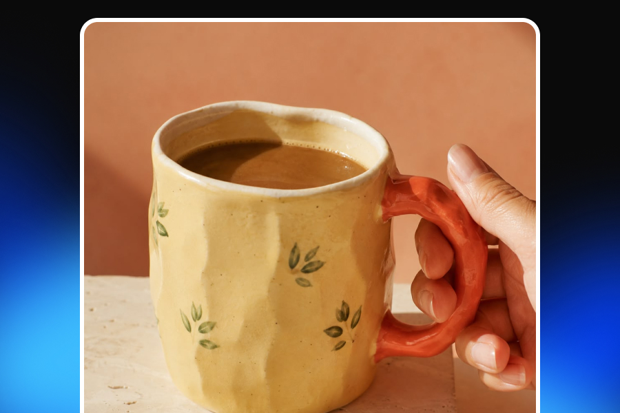
A handmade product often carries its value on the surface. It may be visible in the slight difference between two ceramic glazes, the tiny hammer marks on a ring, the natural grain of a leather bag, or the irregular edge of a hand-poured candle. These details are more than decorative characteristics. They are evidence of process, material, judgment, and time. They tell the customer that the object was shaped, finished, stitched, carved, painted, or assembled by a person rather than produced as one identical unit among thousands.
The problem is that these qualities can disappear surprisingly quickly once the product enters a commercial visual workflow. In an attempt to make an image look more professional, brands may smooth textures, correct asymmetry, standardize colors, simplify surfaces, or style the product so heavily that the making process becomes invisible. AI-generated product imagery introduces another layer of risk. A scene may look realistic and commercially impressive while quietly changing the product itself: a stitch moves, a stone is duplicated, a label becomes unreadable, or the material starts to look more polished than it does in real life. The final image may be attractive, but the product no longer feels handmade.
That does not mean handmade businesses should avoid professional photography, polished e-commerce visuals, or AI-assisted creative tools. Authenticity is not the same as poor image quality. Blurry photographs, inconsistent lighting, inaccurate colors, cluttered backgrounds, and confusing compositions do not make a product feel more genuine. They simply make it harder for customers to understand what they are buying. The real challenge is more nuanced: how can a brand create commercially strong visuals without removing the details that make the product worth buying in the first place?
The answer begins with a different definition of professional product photography. For handmade brands, professionalism should not mean eliminating every irregularity. It should mean presenting the product clearly, consistently, and beautifully while preserving the material character, natural variation, and maker’s touch that give it meaning. The best handmade product photography does not make an item look factory-perfect. It makes the craftsmanship easier to see.
Why Handmade Products So Often Look Mass-Produced Online
Commercial photography is built around control. The photographer controls the light, composition, background, reflections, color, depth of field, and position of the product. In many product categories, this control is necessary. A standardized electronic device, packaged food item, or mass-produced accessory should appear consistent across its catalog. Customers expect the product they receive to match the image closely.
Handmade products require the same visual discipline, but they do not always benefit from the same visual uniformity. Two hand-thrown cups may share the same design while having slightly different rims. A set of hand-painted plates may show small shifts in brush pressure or pigment concentration. Natural leather can vary in grain from one piece to another. A woodworker may repeat the same form, but the grain pattern and knots will never be identical. Handmade stones, textiles, candles, and soaps can all carry differences created by their materials and production processes. When those differences are erased, the product may become easier to present as a standardized object, but its handmade value becomes harder to recognize.
One common problem is excessive retouching. Surface texture is often reduced because smoothness is associated with quality. Shadows are softened until the shape loses depth. Product edges are corrected until they become perfectly symmetrical. Color variation is removed to create visual consistency. Individual products are made to look identical even when the real inventory naturally varies.
Another problem is generic art direction. Many handmade brands are placed into the same visual template: beige linen, a wooden surface, dried plants, warm light, and a softly blurred background. That style may suit some products, but it has become so familiar that it can feel less like an authentic brand decision and more like a stock definition of “handmade.” A brightly colored contemporary ceramics studio, a minimalist metal jewelry brand, a luxury leather workshop, and a playful textile maker should not all be photographed in the same way. Handmade is a method of creation, not a single visual aesthetic.
Over-styling can also weaken product clarity. A beautifully decorated scene may attract attention, yet leave the customer unsure about the product’s size, material, shape, or finish. Props compete with the item. Shallow depth of field hides important details. Strong color grading changes the real tone of the material. A dramatic lifestyle image may build mood while providing very little useful information. This matters because e-commerce product images are not only advertising assets. They also function as evidence.
Customers use images to judge dimensions, texture, construction, color, scale, quality, and variation. They are trying to answer practical questions before purchasing:
Will the item look the same in my home?
Is the surface smooth or textured?
Is the product small enough to hold comfortably?
Are the edges hand-finished?
Will the color vary from piece to piece?
Is the material natural or synthetic?
Does the product look as detailed up close as it does from a distance?
When visuals become too idealized, the distance between the image and the real object grows. That gap can reduce trust, increase uncertainty, and create disappointment even when the physical product is genuinely well made. A strong handmade visual strategy therefore starts with a simple principle: the real product must remain the source of truth. The background can change. The crop can change. The product can be shown in a studio, a lifestyle scene, an advertisement, or a seasonal campaign. The visual style can become more refined and more commercial. But the product’s shape, color, material, texture, construction, and meaningful variation should remain accurate.
The Handmade Feel Is Created by Evidence, Not Styling Clichés
The phrase “handmade feel” can sound subjective, but it becomes much clearer when it is connected to specific visual evidence. A product feels handmade when the image allows the viewer to notice how the object was made, what it was made from, and where human decisions shaped the final result. That evidence usually appears through material character, natural variation, construction details, and process.
Material character is often the first thing that disappears in weak commercial imagery. Clay, leather, wood, metal, fabric, wax, and stone each interact with light differently. Clay can appear porous or softly reflective depending on its finish. Glaze can contain depth, movement, and changes in color. Leather has grain, small creases, and a surface that responds to bending. Wood contains direction, knots, pores, and changes in tone. Fabric is made from visible fibers and repeated structures. Metal can carry polishing lines, hammer marks, scratches, or patina. When lighting or editing flattens these details, the product may still be recognizable, but it loses its tactile quality. Customers can see the object without being able to imagine how it feels.
Natural variation is another important signal. In industrial production, variation is generally treated as inconsistency. In handmade work, certain kinds of variation are expected and valued. The challenge is to communicate which differences are intentional, natural, and acceptable. A ceramic maker may produce a series of bowls with the same dimensions and general design while allowing the glaze to react differently during firing. A jeweler may use natural stones that vary slightly in tone and pattern. A woodworker may follow the same measurements while working with grain that changes from one piece to another. A textile maker may repeat a design with small differences in hand stitching or pattern placement. If a listing shows only one highly controlled example, customers may assume every item will be visually identical. A variation image can be far more honest and persuasive. It allows the brand to explain that each piece follows the same design while retaining individual material characteristics.
Construction details also communicate value. Stitching, engraving, joinery, carving, soldering, weaving, glazing, shaping, cutting, painting, and finishing are not simply technical steps. They are part of the product story. A close-up of a hand-burnished leather edge can demonstrate quality more effectively than a paragraph claiming that the bag was made with care. A detailed image of a jewelry setting can show precision. A photograph of wood joinery can explain why a piece of furniture is durable. Visible embroidery can communicate hours of work at a glance. This is why the word “handmade” should not be expected to carry the entire message. Customers have seen it used broadly and sometimes inaccurately. Strong product images make the claim more believable by showing the work.
Process photographs can deepen that proof. A maker does not need to reveal every step or turn the listing into a documentary. One carefully chosen image may be enough: hands shaping clay, thread passing through leather, wax being poured, a stone being set, a pattern being embroidered, or wood being carved. The process image connects the finished product to a human action. It makes the object feel less anonymous.
However, handmade authenticity should not be confused with exaggerating roughness. Not every visible mark is meaningful, and not every product benefits from looking unfinished. A luxury handmade ring may require extraordinary precision. A minimalist ceramic studio may produce highly controlled forms. A couture textile product may be almost perfectly symmetrical. The goal is not to manufacture imperfection. It is to preserve the details that genuinely belong to the product and its production process.
How to Create Commercial Polish Without Erasing Character
Professional editing can improve handmade product photography significantly. The key is understanding what should be refined and what should remain untouched. Correcting exposure can make the product easier to see. Adjusting white balance can restore accurate color. Removing dust from the background can reduce distraction. Straightening the image can improve composition. Cropping can help the visual fit a marketplace, website, advertisement, or social media format. These are presentation-level improvements. They make the image clearer without changing the item.
The problem begins when the edit changes the product’s identity. Imagine a handmade leather wallet photographed in a small studio. Correcting the overall color so that the brown matches the real material is useful. Removing a temporary dust particle from the surface may also be reasonable. But smoothing the leather until the grain disappears changes the product. Replacing slightly varied hand stitching with a digitally perfect line changes the product. Making the wallet thinner or more symmetrical changes the product.
The same distinction applies to other materials. A ceramic glaze can be brightened without making every area the same color. A knitted fabric can be sharpened carefully without turning soft fibers into harsh digital lines. A hand-hammered metal surface can be cleaned without removing the marks that define it. A wooden object can be color-corrected without replacing its real grain. A hand-poured candle can be presented neatly without making the surface unnaturally uniform.
A useful editing principle is:
Refine the presentation, not the product’s identity.
This balance is sometimes described as controlled imperfection. It means using intentional lighting, clean composition, accurate colors, and thoughtful art direction while preserving the natural irregularities that carry meaning. Controlled imperfection does not mean every mark must stay visible. Temporary production debris, damaged packaging, accidental scratches, stains, or distracting background elements may not contribute anything useful. They can make the product appear neglected rather than handmade.
The distinction lies in context.
Does the detail reveal the material or the making process?
Is it part of the product customers will receive?
Does it demonstrate craftsmanship or simply distract from it?
Would removing it create a more accurate image or a less accurate product?
These questions are more valuable than a general instruction to make everything look perfect.
Lighting plays a particularly important role because it can preserve or erase material character before any retouching begins. Soft frontal lighting creates an even and clean result, which may work well for a hero image. However, it can flatten texture. Directional light from the side or from a three-quarter angle produces small highlights and shadows across the surface. Those changes reveal grain, stitching, carving, glaze, embossing, and shape. The objective is not to create dramatic shadows that hide the product. It is to give the surface enough visual depth for the customer to understand it.
Reflective materials require additional care. Jewelry, polished ceramics, glass, and metal can produce highlights that either reveal form or completely obscure it. Diffusion, controlled light sources, and intentional angles can help preserve detail without making the product appear dull. Color accuracy is equally important. Handmade materials often contain subtle tones that can shift under different lighting. Warm light may make natural leather appear more orange. Strong editing may push ceramic glaze toward a color that is more visually appealing but less accurate. Dark wood can lose visible grain if shadows are deepened excessively. A commercial image can have a distinct art direction, but the buyer should still be able to recognize the real product.
A Complete Handmade Product Gallery Should Answer Questions
A common weakness in handmade product listings is repetition. The seller creates one attractive composition and fills the gallery with slightly different versions of the same photograph. The product is moved, rotated, or cropped, but the customer receives very little new information. A stronger product gallery works as a sequence. Each image answers a different question.
The hero image introduces the product. It should be clear enough for the customer to understand what is being sold immediately. The silhouette should be visible, the color should be accurate, and the product should have enough space around it to remain easy to identify. For some marketplaces, the main image may need to be more restrained and product-focused. A brand’s own Shopify store may allow more creative freedom. In either case, the first image should prioritize clarity over atmosphere.
A three-quarter image can then reveal depth, side construction, handles, closures, edges, or other elements that a front-facing view may hide. For ceramics, bags, furniture, candles, boxes, and sculptural objects, this angle is particularly useful.
The next image may move closer. A texture or craftsmanship detail should show the part of the product that carries the most visual evidence of work. This may be an engraved surface, hand stitching, a ceramic glaze, a carved joint, fabric weave, stone texture, or a painted edge. The close-up should not be included simply because close-up images are expected. It should show something meaningful.
Scale images reduce a different type of uncertainty. A product can be shown in the hand, on the body, beside a familiar object, or within its intended space. A cup photographed alone may appear larger than it is. A bag may look spacious without a clear reference. Furniture can appear smaller when placed in a large interior. Jewelry can be difficult to understand without a model or body reference. Scale should be demonstrated honestly. Surrounding objects should not make the product appear dramatically larger or smaller than reality.
Lifestyle photography adds context. It shows how the product fits into a routine, room, outfit, activity, or emotional moment. However, lifestyle scenes should not become decorative puzzles. The product must remain the focus, and the environment should make sense for the customer. A handmade candle may be shown in a calm evening setting. A ceramic mug can appear in a kitchen or workspace. A leather bag can be photographed in a realistic travel or daily-use scene. Handmade jewelry can be shown on the body to communicate proportion and styling. The most successful lifestyle images do not simply look attractive. They help the customer imagine ownership.
Process photographs introduce the maker and the act of creation. This might include shaping clay, working at a loom, stitching leather, pouring wax, assembling jewelry, or finishing wood. Even when the maker’s face is not visible, hands, tools, raw materials, and the studio environment can create a stronger connection to the work.
Variation images are essential when the inventory is not perfectly uniform. A group photograph can show how glaze, grain, color, pattern placement, stone texture, or hand-painted details may differ. The image can be supported by a short explanation that every product follows the same design but retains individual characteristics.
Packaging photographs are useful when the unboxing experience is part of the value. Gift-ready wrapping, branded boxes, protective materials, care cards, certificates, reusable pouches, and handwritten notes can influence the purchase decision.
Materials images can add another layer of credibility. Showing raw leather, thread, clay, wood, stones, pigments, wax, or other ingredients helps the buyer understand what the finished product comes from. This can be especially effective for brands that emphasize material sourcing, natural ingredients, or traditional techniques.
Finally, a product-in-use image explains function. It shows how the object behaves rather than only how it looks. A bag can be opened, a candle can be lit, a chair can be placed in a real interior, a scarf can be worn, or a ceramic object can be used at the table.
Together, these images create a complete visual answer to the buyer’s questions:
What exactly am I buying?
How large is it?
What does the material look like up close?
How was it made?
How might my item vary?
How will I use it?
What will the package contain?
Does the quality remain convincing beyond the hero image?
When a product gallery answers these questions, commercial photography becomes a tool for trust rather than decoration alone.
Styling Handmade Products Without Falling Into the “Rustic” Template
Authentic styling begins with the brand. It does not begin with a universal collection of props associated with handmade businesses. Linen, raw wood, natural stone, dried flowers, and warm light can be appropriate. They can also be completely wrong. A handmade product can belong to a bold, graphic, futuristic, luxurious, minimal, youthful, or highly colorful visual world.
A contemporary silver jewelry brand may need cool light, architectural shapes, and a clean reflective surface. A playful ceramics studio may use saturated colors and unconventional compositions. A luxury leather company may prefer restrained lighting and dark, refined materials. A handmade children’s textile brand may benefit from brighter environments and visible movement. The handmade character should come from the product’s truth, not from forcing the brand into a rustic style.
Background selection should therefore be practical as well as aesthetic. The background must separate the product from the environment, support accurate color, and allow important edges and textures to remain visible. Neutral paper can create clarity. Plaster may add subtle texture. Stone can support ceramics or metal. Wood may complement natural materials but can become visually busy. Linen can create softness but may compete with textiles. Brand-colored surfaces can strengthen recognition when they do not distort the product’s color. The best background is not necessarily the most visually interesting one. It is the one that supports the product’s silhouette, material, positioning, and intended use.
Props should also have a clear reason to exist. A tool can connect the object to its making process. Raw material can reinforce craftsmanship. A hand can demonstrate scale. A matchbox can clarify the size of a candle. Thread can support a textile story. Ingredients may make sense near handmade soap if they accurately represent the formula. Props that add neither information nor brand meaning tend to create visual noise.
The same restraint should guide depth of field. Background blur can produce a premium, photographic look, but excessive blur can hide relevant details or make the product feel disconnected from the scene. The product should remain understandable at a glance. Natural-looking does not mean accidental. A believable lifestyle scene is usually carefully art-directed. The difference is that the art direction supports the product instead of announcing itself.
How AI Can Expand the Visual World Without Replacing the Real Product
Handmade businesses face a practical content problem. A single product may need a marketplace hero image, website gallery, lifestyle scenes, product-detail visuals, seasonal campaigns, advertisements, social media posts, email banners, Pinterest images, and short-form video. Each platform requires different dimensions and creative variations.
Traditional photography can produce excellent results, but arranging a new photoshoot for every campaign and format may be difficult for a small brand. Products may be one-of-a-kind, produced in limited quantities, or released frequently. Budgets, locations, models, props, and time can all become constraints. AI-assisted product photography can help brands expand the visual use of existing product assets. It can support new backgrounds, lifestyle settings, scene extension, format adaptation, seasonal variations, social media crops, secondary listing images, and campaign concepts. A product photographed once can potentially appear in several relevant environments without rebuilding the entire production process.
The important phrase is existing product assets. The safest workflow begins with the real product. AI should work around it, not treat it as vague inspiration.
This distinction matters because an AI-generated image can appear convincing while being commercially inaccurate. The system may change the handle of a mug, duplicate a stone in a necklace, modify the stitching of a bag, simplify a fabric pattern, alter a label, add a product feature, or change the scale of the item relative to the scene. These errors are particularly damaging for handmade brands because the changed details may be the same details carrying the product’s value.
An AI image that removes hammer marks from handmade jewelry does not merely create a technical mistake. It removes evidence of the craft. An image that smooths the grain of natural leather changes the material’s identity. A generated ceramic surface that becomes perfectly uniform may make a one-of-a-kind glaze look mass-produced. For this reason, realistic AI product photography should be evaluated according to product fidelity rather than general visual quality alone.
The review should include:
Overall silhouette and shape
Proportions and dimensions
Number of components
Material appearance
Surface texture
Stitching and construction
Colors and finish
Logos and symbols
Labels and readable text
Packaging
Pattern placement
Scale within the generated environment
Natural variations that should remain visible
AI is most useful when it expands context while preserving these elements. That may mean placing the real product in a new lifestyle environment, generating a seasonal background, adapting an established composition to another format, removing unrelated objects from the scene, or building secondary commercial visuals from a trusted reference.
This product-first approach also changes how the creative tool itself should work. A one-time prompt-and-download workflow encourages the user to start over repeatedly. The product is uploaded, an output is generated, and the result is downloaded. If another variation is required, the context may need to be rebuilt.
A connected visual workspace creates a different experience. Products, models, brand elements, files, generated visuals, edits, and project states can remain available and reusable. The user can work directly on an existing visual, modify a selected area, create variations, reuse the product in another project, or extend the scene into video.
In Adject, image generation is one capability inside that wider creative environment. The system is designed around continuous creation rather than isolated outputs. This is especially relevant for handmade brands because it allows the product to remain the source of truth while the visual world around it evolves. Consistency in this context does not mean making every handmade item look identical. It means maintaining a recognizable product and brand across multiple scenes, campaigns, and formats. AI should increase creative range. It should not reduce product truth.
Different Materials Need Different Visual Priorities
The handmade feel changes depending on the material and production process. A general visual rule may work across categories, but the details that deserve attention will not be the same.
Handmade jewelry needs accurate scale, controlled reflections, and close-up detail. Metal surfaces can easily become too dark, too bright, or too smooth. Side lighting may reveal hand-hammered marks and engraving, while a clean hero image communicates the overall form. On-body photographs help customers understand size and proportion, particularly for earrings, necklaces, rings, and bracelets. Natural stones should be represented carefully. Their color, inclusions, transparency, and pattern may vary. If every stone is unique, variation images can help explain what customers should expect.
Ceramics and pottery depend heavily on shape and glaze. A front-facing image may not reveal depth, rim thickness, base, or handle construction. Three-quarter views and close-ups are useful. Controlled highlights can show glaze depth, while side light can reveal throwing lines or hand-painted surfaces. When glaze varies between pieces, photographing several examples together creates a more accurate impression than presenting one item as a universal standard.
Textiles and knitwear need to communicate softness, weave, stitching, structure, fit, and drape. A folded image may be appropriate for the hero photograph, but worn or in-use images often provide more useful information. Close-ups should reveal fibers and handwork without excessive sharpening. Fabric color can change significantly under warm or cool light, so accurate white balance is essential.
Leather goods require visible grain, stitching, edge treatment, hardware, compartments, and shape. Customers may also want to understand how the item bends, opens, closes, or sits when carried. Heavy retouching can make genuine leather appear synthetic. Lighting should preserve texture without exaggerating every mark. Natural variation should be distinguished from accidental damage.
Wood products and handmade furniture need images that show grain, joinery, carving, dimensions, finish, and scale. A lifestyle scene can be powerful, but the size of the room and surrounding objects may distort the viewer’s perception. Measurement graphics or familiar environmental references can support scale, while detailed images can demonstrate construction quality.
Candles and handmade soap rely on texture, packaging, ingredients, color, and sensory context. A candle can be shown lit, but the unlit product should also be visible clearly. Soap may be styled with ingredients, but only when those ingredients accurately relate to the product. Wax surfaces, hand-cut edges, botanical inclusions, and batch variation should not be digitally standardized without reason.
These examples demonstrate why handmade product photography cannot be reduced to a single preset. The visual direction should respond to the product’s material, customer questions, and method of creation.
Adapting the Visual Strategy for Etsy, Amazon Handmade, and Shopify
A handmade brand may sell the same item across several platforms, but each channel gives product imagery a different role.
On Etsy, the visual set needs to communicate the real finished product clearly. Customers often compare several handmade sellers quickly, so the first image must attract attention without creating confusion. Detail, scale, process, variation, packaging, and lifestyle images can then provide a fuller understanding. When AI is used, it should support the real product rather than inventing a different version. Background creation, format adaptation, and secondary lifestyle visuals can be valuable, but the customer still needs an honest representation of the item they may receive.
Amazon Handmade generally benefits from a more structured marketplace approach. The primary image should prioritize clarity, compliance, and immediate product recognition. More expressive images can follow in secondary positions, where lifestyle, process, materials, packaging, and craftsmanship details add depth. A useful strategy is to begin with a clear, marketplace-focused hero image and use the rest of the gallery for richer visual storytelling.
Shopify gives brands more control over their entire visual environment. The product gallery can work together with homepage imagery, collection pages, editorial content, campaigns, and brand storytelling. This flexibility makes visual consistency especially important. Different products should feel connected to the same brand even when they appear in different locations or creative concepts.
Consistency can come from lighting, background logic, composition, model direction, color palette, crop, and the way materials are shown. It should not come from making every product image identical. A Shopify store also creates more room for maker stories, studio photography, materials, production details, and longer visual sequences. The brand can move beyond a single listing and build a complete visual world around the craft.
A Pre-Publish Review for Handmade Commercial Visuals
Before publishing a product image, view it at full resolution and compare it with the real item or trusted reference photographs. Start with product accuracy. Is the shape correct? Are the proportions believable? Does the product contain the right number of stones, buttons, handles, pockets, legs, straps, or decorative elements? Are the logo, label, and packaging accurate? Does the material still look like the real material?
Then examine the handmade character. Can the customer see the texture? Are meaningful tool marks, stitching, grain, glaze movement, carving, fibers, or hand-painted details still present? Have natural variations been removed simply to make the product appear more uniform?
Review the commercial quality separately. Is the image sharp where it needs to be? Is the lighting intentional? Does the background support the product? Is the crop suitable for the intended platform? Does the image match the visual language of the rest of the catalog?
Finally, consider buyer understanding. Can the customer understand the scale? Can they see important construction details? Do they know how the product is used? Are variations explained? Does the image set create realistic expectations?
For AI-assisted images, add another layer of scrutiny. Did the AI change the product or only the intended part of the scene? Did it distort text, add features, remove details, alter the material, or create an unrealistic relationship between the product and surrounding objects? A visually impressive image is not ready for commercial use if it cannot pass this review.
The Goal Is Not Perfection. It Is Believability.
Handmade businesses do not need to choose between weak photography and commercial visuals that erase their identity. A professional image can be clean, polished, consistent, and visually ambitious while still showing the marks of human work. In fact, the strongest commercial presentation often makes those details easier to appreciate.
It gives the customer a clear view of the silhouette, material, texture, construction, scale, and intended use. It shows enough variation to create realistic expectations. It uses process and context to support the maker story. It allows the product to appear premium without pretending that it was produced by a machine.
AI can make this visual system more scalable. It can help a small brand create more scenes, formats, campaign assets, and secondary images from a limited set of product photographs. A connected workspace can preserve the relationship between the product, project, previous visuals, brand assets, edits, and new variations. But technology does not remove the need for judgment.
The product must remain the source of truth. Creative styling should happen around it. Every generated or edited visual should be checked against the real item. Product fidelity, material accuracy, readable branding, and honest scale are not optional details. They are part of customer trust.
The handmade feel is not created by making an image look less professional. It is created by knowing which details should never be polished away. A ceramic glaze that shifts slightly in the light, a stitched edge, a carved joint, a hammered surface, a natural stone, or the changing grain of wood can all carry the story of the maker. The job of commercial product photography is to make that story visible.


