
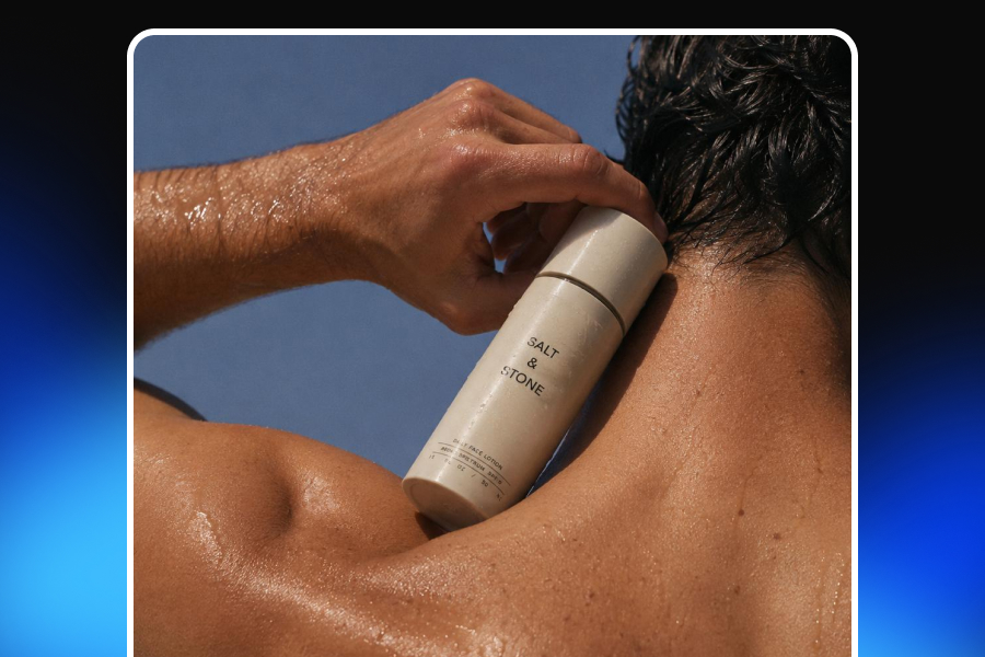
A cosmetic product can look premium on a bathroom shelf and surprisingly ordinary in a photograph. The glass bottle that catches light beautifully in person may show the reflection of the entire room on camera. A metallic cap may turn into a bright white patch. Small packaging text may become unreadable, while a slightly incorrect white balance can make a beige foundation look orange or a clear serum appear yellow.
These problems are one reason professional beauty product photography can become expensive. A traditional production may require a photographer, studio rental, lighting equipment, retouching, prop sourcing, art direction, and several rounds of editing. The cost becomes even harder to justify when a brand needs new visuals for every product launch, seasonal campaign, marketplace format, advertising test, and social media channel.
However, a physical studio is not the only way to produce professional-looking cosmetic images.
With a carefully prepared source photo, a simple lighting setup, and an AI-assisted creative workflow, beauty brands can create clean, consistent, studio-quality product photos without arranging a complete photoshoot for every visual. The goal is not to hide poor photography behind artificial effects. It is to build a practical system in which a basic but accurate product image can be refined, adapted, and reused across multiple commercial contexts.
This guide explains how to photograph cosmetic products without a studio, how to control the reflections created by glossy and transparent packaging, how to protect product and color accuracy, and how AI product photography can help brands scale their visual production without making their products look artificial.
What a Clean Studio Cosmetic Image Actually Looks Like
A clean studio image is often confused with a product placed on a completely white background. A white background may be part of the result, but it is not enough on its own.
A high-quality cosmetic packshot should make the product easy to understand at a glance. The packaging shape should be accurate, the label should remain readable, and the visual should not contain unnecessary props or environmental details that compete for attention. Light should reveal the material of the packaging rather than flattening it. The product should feel grounded by a natural contact shadow, not appear as though it has been pasted onto the background.
The best clean product photography also includes controlled imperfections. A glass bottle should still look like glass. A metallic cap should reflect light. A glossy tube should contain highlights that explain its curved form. Removing every reflection can make these materials look flat and synthetic. The goal is therefore not to eliminate reflections completely, but to replace uncontrolled glare with deliberate highlights.
Color accuracy is equally important. Cosmetic photography is closely connected to customer expectations. A skincare customer wants to understand the tone and texture of the packaging. A makeup customer may be evaluating a lipstick, foundation, or eyeshadow shade. If the image is excessively warm, cool, saturated, or desaturated, the product may no longer resemble the item the customer receives.
A strong clean studio image therefore combines several elements:
A neutral and distraction-free background
Accurate product shape and proportions
Sharp, readable labels and logos
Controlled highlights on reflective surfaces
A believable contact shadow
Realistic packaging materials
Consistent product color
A balanced composition created for ecommerce use
When these elements work together, the photograph feels polished without looking overproduced.
Why Cosmetic Products Are Difficult to Photograph
Cosmetics are small products, but their surfaces are visually complex. Many beauty items combine several difficult materials in a single package. A serum bottle may include transparent glass, reflective liquid, a metallic collar, a plastic pump, and a paper label. Each surface reacts differently to light.
This is why cosmetic product photography requires more control than photographing a simple matte object.
Glossy Plastic and Metallic Packaging
Glossy tubes, lipstick cases, compact powders, and metallic caps act like small mirrors. They reflect the camera, the photographer, nearby furniture, windows, walls, and any bright object in the room. A product may look clean to the eye while the camera records distracting shapes across its surface.
Harsh point-like lights create particularly aggressive reflections. A small lamp may produce a bright white mark that hides the logo or makes the packaging look damaged. Direct flash can create an even stronger problem by producing flat frontal light and intense glare.
The solution is usually not stronger editing. It is creating a larger and softer light source before taking the photograph. A large diffused light creates broader, smoother highlights that reveal the product’s form without covering important packaging details.
Glass Bottles and Transparent Liquids
Glass cosmetic packaging presents a different challenge. Clear bottles can disappear against light backgrounds because their edges do not have enough contrast. Dark backgrounds may make the bottle visible, but can also create heavy reflections or distort the color of the liquid.
Transparent liquids add another layer of complexity. The color and liquid level must remain realistic. Incorrect lighting can make a clear serum look cloudy, cause a pale oil to appear too dark, or create bright refractions that hide the label.
Successful cosmetic bottle photography often depends on edge definition. White and black cards placed outside the frame can control what the bottle reflects. A white card can create a soft highlight, while a black card can produce a narrow dark line that defines the edge of the glass.
Small Labels and Fine Typography
Beauty packaging often contains small typography, ingredient information, volume details, or minimalist branding. These elements need to remain sharp because shoppers use them to verify the product.
A slightly blurred photograph may still look acceptable on a phone screen, but the weakness becomes obvious when the image is enlarged on a product page. AI editing can also introduce packaging errors if the label is not protected carefully. Letters may change, logos may become distorted, and lines of text may appear plausible from a distance while becoming unreadable at full resolution.
For this reason, label legibility should be treated as a quality requirement rather than a final cosmetic detail.
Color Accuracy for Makeup and Skincare Products
Incorrect color is one of the most serious problems in makeup product photography. Customers may be comparing similar lipstick tones, foundation shades, or eyeshadow colors. Even a subtle color shift can create the wrong expectation.
Automatic phone processing can change color by increasing contrast, saturation, or warmth. Mixed lighting can make the issue worse. For example, combining warm indoor lighting with cool window light may create different color casts on opposite sides of the same package.
A controlled white balance and a consistent light source help preserve true-to-life product colors. Any AI workflow should also be checked against the original source image to ensure that the product has not become warmer, cooler, darker, or more saturated during generation.
Consistency Across Multiple Products
A single good image is useful. A visually consistent product catalog is much more valuable.
Beauty brands often sell multiple sizes, shades, formulas, and packaging variations. If every product is photographed at a different angle or distance, the collection page begins to look disorganized. Inconsistent shadows and background tones can make related products feel as though they belong to different brands.
For this reason, cosmetic product photography should be approached as a repeatable system. Camera angle, product scale, background tone, lighting direction, and shadow softness should remain consistent across the product line.
Start With a Better Source Photo
AI can improve an image, but it cannot guarantee reliable commercial results from a poor source. The cleaner and more accurate the original photograph is, the easier it becomes to create realistic variations later.
The source image does not need to look like a final advertising campaign. It needs to provide the system with a clear and trustworthy representation of the product.
Prepare the Product Before Shooting
Clean the packaging carefully. Remove dust, fingerprints, makeup residue, water spots, and adhesive marks. Check the label for wrinkles or lifted corners. Examine the cap, pump, and edges for damage.
These small issues become highly visible in close-up cosmetic photography. Although they can sometimes be removed during editing, correcting them before shooting is faster and helps preserve the product’s real appearance.
If the product contains liquid, check that the level is even and that no bubbles or residue are visible unless they are naturally part of the formulation.
Choose a Simple Neutral Background
A white, light gray, or soft neutral background is usually the safest option for a source image. Matte card, foam board, or clean paper can work well. The background does not need to be perfectly seamless at this stage because it may later be replaced or refined with AI.
The important point is separation. The product should not blend into the background, and the surface should not contain patterns or textures that make masking difficult.
A white product on a pure white background may need a slightly darker gray behind it so that the edges remain visible. A transparent glass bottle may also benefit from a background that creates enough contrast for the system to understand its shape.
Use One Large, Soft Light Source
Indirect window light is one of the most practical options for cosmetic product photography at home. Position the product near the window rather than directly under sunlight. Harsh sunlight can produce sharp shadows and uncontrolled glare, while indirect light creates smoother transitions across curved packaging.
A sheer curtain can act as a diffuser. A large white fabric, tracing material, or diffusion panel can also soften a continuous light.
Avoid mixing several light sources with different color temperatures. Turning off warm ceiling lights while using daylight can help maintain accurate color. If you are using artificial lighting, use lights with the same color temperature.
Stabilize the Camera
Use a tripod, phone stand, or stable surface. Small label details require sharp focus, and even minor hand movement can reduce clarity.
Clean the phone or camera lens before shooting. A fingerprint on the lens can create haze, lower contrast, and make the image look less professional.
Use the main camera rather than an ultra-wide lens. Wide-angle lenses can stretch the packaging, particularly when the camera is positioned too close. Move the camera farther away and crop slightly if necessary.
Capture Several Useful Angles
Take more than one source image. A straight-on view is usually the best starting point for a clean hero image, but additional angles can help with later creative production.
Useful source angles may include:
Straight front view
Slightly elevated front view
Three-quarter angle
Side view
Packaging detail
Open product or applicator view
Keep the camera height and distance controlled. If you are photographing several SKUs, mark the product and tripod positions so that the setup can be repeated.
A Simple No-Studio Lighting Setup
A small beauty brand does not need a full professional studio to create a usable source image. A simple setup can provide enough control for both traditional editing and AI cosmetic product photography.
Place the product on a clean table or sheet of matte board. Position a large window or diffused light approximately 45 degrees to one side of the product. On the opposite side, place a white foam board to reflect some light back into the shadow area.
This creates a basic key-and-fill arrangement. The window or main light defines the product, while the white card prevents the opposite side from becoming too dark.
If the packaging is transparent or reflective, place a narrow black card outside the camera frame. Watch the product surface while moving the card. The dark reflection can create a clean edge that makes a glass bottle or metallic cap easier to see.
The position of the card matters more than its price or material. Professional product photography frequently relies on simple black and white surfaces because reflective products show the environment around them. By choosing what the product reflects, you effectively shape its appearance.
For a clean white-background result, allow some distance between the product and the background. This helps prevent unwanted shadows and gives you more control when separating the product later.
How to Control Glare Without Making the Product Look Flat
Glare is one of the most common problems in reflective packaging photography, but completely removing all highlights is not the correct objective.
Highlights communicate shape. A soft vertical highlight can show that a serum bottle is cylindrical. A narrow reflection along the edge of a lipstick case can explain its metallic finish. Without these visual cues, the packaging may look like a flat digital cutout.
The goal is to create reflections that support the product rather than compete with it.
Increase the Apparent Size of the Light
The larger the light source appears from the product’s position, the softer the reflection becomes. A small exposed bulb produces a small and harsh highlight. A large diffused panel produces a broader and smoother transition.
Moving a diffusion surface closer to the product can make it appear larger, even if the light itself stays in the same place.
Adjust the Light Angle
When glare covers the label, many people rotate the product immediately. This may solve the reflection but create an unattractive product angle. Instead, move the light or diffusion panel while keeping the product position stable.
Reflective surfaces follow predictable geometry. Small changes to the light angle can move a highlight away from the label while preserving the front-facing composition.
Shape Reflections With Cards
White cards create light reflections. Black cards create dark reflections. Both can be used intentionally.
For example, a clear glass perfume bottle on a light background may lack visible edges. Narrow black cards on both sides can create subtle dark outlines. A glossy black jar may require white cards to reveal its curved surface.
These cards should usually remain outside the photographed frame. Their purpose is not to appear in the scene, but to control what the packaging reflects.
Be Careful With Ring Lights
Ring lights are convenient for faces, but they often create obvious circular reflections on cosmetic packaging. A bright circle on a bottle or cap immediately reveals the lighting setup and can make the image feel amateur.
A ring light can still be used if it is heavily diffused or positioned at an angle, but a larger rectangular light source is usually easier to control for product photography without glare.
Turning a Source Photo Into a Clean Studio Image With AI
Once the source image is clean, sharp, and accurate, AI can help transform it into a more polished commercial visual.
The strongest AI product photography workflows do more than replace the background. They allow the brand to continue editing, generate related variations, preserve product assets, and reuse the same visual context across future projects.
This is where Adject v2.0 differs from a basic one-time image generator.
Instead of following a process such as “upload, generate, download, and start again,” Adject is designed around a continuous workflow inside a visual canvas. Products, models, brand elements, and files can be stored as reusable assets. The AI agent works within the canvas, helping the user modify existing visuals, create variations, and maintain context throughout the project.
A practical AI cosmetic product photography workflow may look like this:
Upload and Save the Product as an Asset
Begin with the cleanest available source image. The product can then remain available for future projects rather than being uploaded again for every creative.
This is especially valuable for brands that produce frequent campaign content. The same serum, lipstick, moisturizer, or perfume bottle may need to appear in product listings, social advertisements, launch visuals, seasonal campaigns, and video content.
Build the Clean Studio Scene on the Canvas
Place the product on the canvas and define the intended result. This may include a seamless white or warm-white background, soft side lighting, controlled reflections, and a subtle contact shadow.
The instruction should communicate the visual intention clearly. The user should not need to understand complicated model parameters. The goal is to describe what the final image should accomplish.
Refine Specific Areas
A generated image may be close to the intended result but still require adjustment. The background may be slightly too warm. The shadow may be too dark. One reflection may cover the label.
Instead of regenerating the entire image and potentially losing the elements that already work, a canvas-based workflow allows specific areas to be selected and modified.
This contextual editing is important for cosmetic products because small details can determine whether an image feels professional or artificial.
Create Variations From the Approved Image
Once the clean studio version is approved, it can become the base for additional outputs.
The same product can be adapted into:
A pure white product listing image
A warm neutral skincare hero image
A square social media post
A vertical advertising creative
A product detail crop
A minimal campaign image
A short-form video
Because the product and project history remain connected, the user does not need to rebuild the visual direction from the beginning every time.
How to Describe the Desired Result
A long and complicated prompt is not always better. The most useful instruction clearly defines the visual result and the commercial purpose.
For a clean cosmetic studio image, include the following information:
The type of cosmetic product
The preferred background color
The camera angle
The direction and softness of the light
The type of shadow
The surface material
The desired reflection intensity
The composition
The level of color accuracy
The requirement to preserve labels and packaging
For example:
“Create a realistic clean studio image of this skincare serum bottle on a seamless warm-white background. Use large diffused side lighting, controlled glass reflections, a soft contact shadow, a centered ecommerce composition, accurate packaging colors, and a sharp readable label. Preserve the original bottle shape, logo, pump, and liquid appearance.”
The final sentence is particularly important. Asking the system to preserve the original shape, branding, and product details reduces ambiguity and makes the commercial requirement clear.
Product Accuracy Must Be Part of the Workflow
An attractive image is not useful if it misrepresents the product.
AI-generated cosmetic visuals should always be compared with the original product. This is especially important for labels, logos, packaging shapes, applicators, liquid levels, and color.
Check whether the system has changed:
The spelling or position of the logo
The number of lines on the label
The size or shape of the cap
The design of the pump
The width or height of the bottle
The color of the packaging
The amount or appearance of the liquid
The shape of a lipstick bullet or makeup applicator
The relationship between the product and its shadow
Some errors are obvious. Others are subtle enough to pass at first glance but become problematic when the customer compares the image with the real item.
This is why realistic AI product photography requires human review. AI can accelerate production, but the brand remains responsible for deciding whether the visual is accurate enough for commercial use.
A Quality-Control Checklist Before Publishing
Before exporting any cosmetic product image, review it at full resolution. Do not evaluate only the small preview.
Start with the product itself. Confirm that the shape, proportions, packaging color, logo, and label match the original item. Zoom in on small typography. Look for invented letters, softened details, or changes to the packaging design.
Then evaluate the lighting. The highlight and shadow should suggest the same light direction. If the main highlight appears on the left side, the contact shadow should not imply that the light is coming from the opposite direction. Reflections should follow the shape of the material and should not contain unexplained bright patches.
Check the point where the product touches the surface. A realistic contact shadow is usually darkest and most defined directly under the product, becoming softer as it moves away. A uniform gray oval placed under the object often looks artificial.
Review the background for masking problems, halos, jagged edges, or color contamination. Transparent glass and fine packaging edges deserve special attention.
Finally, compare the image with other product visuals in the catalog. Ask whether the product scale, camera angle, background tone, and shadow style remain consistent across the collection.
A useful final checklist includes the following questions:
Is the logo correct and undistorted?
Is all important label text readable?
Does the product color match the original?
Are the cap, pump, and applicator accurate?
Is the bottle or package shape unchanged?
Does the liquid look realistic?
Do the reflections support the product’s form?
Is the contact shadow believable?
Does the product look grounded?
Are the edges clean?
Is the composition consistent with other SKUs?
Is the image prepared in the correct platform ratio?
Clean Studio Images and Lifestyle Images Serve Different Purposes
A clean studio image should not replace every other type of visual. Product-only and lifestyle photography support different parts of the customer journey.
Clean studio product photos provide clarity. They are useful for product pages, catalogs, collection pages, product comparisons, and marketplace listings. The shopper can evaluate the packaging without being distracted by props, models, or background details.
Lifestyle images create context and emotion. They help customers imagine the product in a routine, environment, or identity. A skincare serum may appear in a bright bathroom scene. A perfume may be presented through a more atmospheric campaign image. Makeup products may be shown with textures, models, or color-focused compositions.
A strong beauty product image set usually includes both.
The clean hero image establishes trust and product clarity. Supporting lifestyle visuals communicate positioning, aspiration, and use. The same approved product asset can be developed into both formats through a connected creative workflow.
Common Mistakes That Make Cosmetic Product Photos Look Artificial
One of the biggest mistakes is attempting to make the product too perfect. Excessive smoothing can remove the subtle material qualities that make the packaging believable. Glass becomes plastic, metal becomes flat, and textured paper labels become unnaturally clean.
Another common issue is contradictory lighting. A product may contain highlights from several directions while the shadow suggests a single light source. This visual inconsistency makes the image feel generated even when the viewer cannot identify the exact problem.
Overly strong background blur can also reduce credibility. Blur is useful in lifestyle photography, but a product listing image should provide enough sharpness for the customer to inspect the item. Artificial blur around the product edges is particularly distracting.
Floating products are another frequent problem. If the shadow is too far from the object or does not become darker near the contact point, the product may appear to hover above the surface.
Packaging distortion is even more serious. A slightly stretched bottle, altered cap, or modified label may create a visually attractive result that cannot be used commercially.
The best AI cosmetic product photography does not call attention to the AI. It looks like controlled commercial photography because the light, product, background, and shadow follow the same visual logic.
From One Product Photo to a Scalable Creative System
The real value of this workflow is not limited to producing one clean image. Beauty brands need a continuing supply of content.
A product launch may require a listing image, several product-page visuals, social media posts, paid advertising formats, landing page banners, retailer assets, email campaign images, and short-form video. Producing each asset through a separate traditional workflow can slow the entire campaign.
Adject’s canvas, AI agent, asset system, and project structure are designed to keep this process connected. The product remains reusable. The creative history stays inside the project. Existing visuals can be modified rather than recreated. Approved images can be adapted into new sizes, backgrounds, and formats while maintaining a consistent visual direction.
This approach is particularly useful for brands with multiple SKUs or frequent launches. Instead of treating every image as a separate production, the brand builds an evolving library of accurate products and approved visual styles.
The result is not simply faster image generation. It is a more organized creative operation.
Final Takeaway
Professional cosmetic product photography does not begin with expensive equipment. It begins with control.
A clean product, a stable camera, a neutral background, and a large soft light source can create a strong source image even without a studio. Reflection cards and careful light positioning can solve many of the problems caused by glossy plastic, metallic packaging, and glass bottles.
AI can then help refine the scene, create clean studio backgrounds, improve shadows, generate variations, and prepare the product for different ecommerce and campaign formats. However, product accuracy must remain the priority. Labels, colors, packaging proportions, and material details should always be checked against the original item.
For beauty brands, the most effective approach is not to choose between traditional photography and AI. It is to combine a reliable source capture with an AI-assisted workflow that makes the visual reusable, editable, and scalable.
With one clean product image, Adject allows brands to continue working inside a unified canvas, preserve products as reusable assets, refine individual areas, generate consistent variations, and expand approved visuals into new formats without organizing a complete photoshoot every time.
