
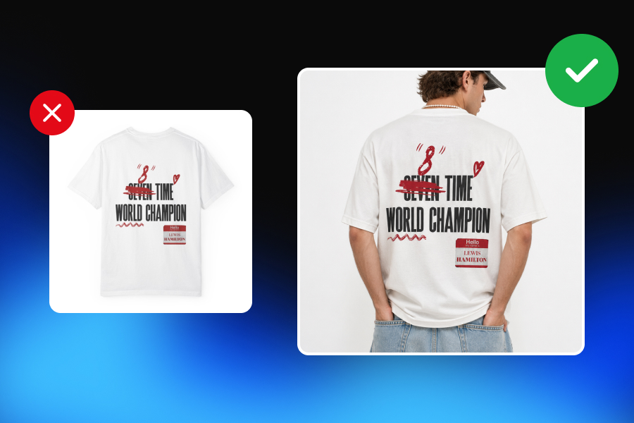
The real bottleneck in print-on-demand is not always creating more designs.
Most POD sellers already have ideas. They have quotes, illustrations, patterns, niche concepts, seasonal messages, and product ideas waiting to be launched. The harder part is turning those designs into product visuals that actually sell.
Because one design is not enough.
A design sitting on a blank T-shirt mockup, mug template, tote bag preview, or framed poster image may show what the product is. But it rarely shows why someone should care.
That is where many print-on-demand sellers get stuck. They create one design, upload the default supplier mockup, add a few product variants, and expect the listing to do all the selling.
But modern e-commerce does not work that way.
Customers do not only need to see the artwork. They need to understand the product, imagine it in their life, trust the quality, compare options, feel the scale, connect with the message, and sometimes see the same design in a seasonal or social context before they decide to buy.
That means one strong POD design should not become one product image.
It should become a complete visual system.
Not ten random backgrounds. Not ten nearly identical lifestyle mockups. Not the same T-shirt placed in five different cafés.
A successful print-on-demand image set is built with purpose. Every visual should do a different job: win the click, explain the product, reduce doubt, create desire, show scale, highlight texture, compare colors, target an audience, refresh the product for a season, or support an ad campaign.
This guide explains how print-on-demand sellers can turn one design into 10 sellable visual variations—and how to make each one commercially useful.
One Design Is Not One Product Image
A common mistake in print-on-demand is treating the design file as the product.
But the customer does not buy a PNG file.
They buy a T-shirt they can wear, a mug they can gift, a poster they can hang, a hoodie they can style, or a tote bag they can carry.
That difference matters.
Your design may be the creative asset, but your product visuals are what translate that asset into something the customer understands and wants.
For example, imagine you have a simple typography design that says:
“Plant Mom.”
That same design could be sold as:
A cozy mug for someone’s morning coffee
A relaxed oversized sweatshirt for a homebody
A tote bag for weekend plant shopping
A wall print for a plant-filled apartment
A gift item for Mother’s Day
A social media ad targeting houseplant lovers
The design is the same.
But the buying context changes.
That is why print-on-demand mockups should not only show the artwork. They should show the commercial possibility of the product.
Why Default POD Mockups Are Only the Starting Point
Default mockups are useful. They help sellers launch quickly, keep product representation simple, and show the basic design placement.
But they are rarely enough to build a strong brand or a high-converting listing.
The problem is not that default mockups are bad. The problem is that everyone has access to similar ones.
When hundreds of sellers use the same blank T-shirt pose, the same mug angle, the same hoodie preview, or the same framed poster scene, products start to look interchangeable. Even if your design is original, the presentation can feel generic.
That is especially dangerous in competitive marketplaces like Etsy, Shopify stores, Amazon, TikTok Shop, and social commerce channels, where customers make fast visual decisions.
A default mockup usually answers one question:
“What does the design look like on the product?”
But a strong POD image set answers many more:
How big is it?
How does it look when worn?
Who is it for?
What does the material feel like?
Is it giftable?
Does it match my style?
Which color should I choose?
Would this look good in my home, wardrobe, or daily routine?
Can I trust what I am seeing?
That is why default mockups should be treated as the foundation, not the full strategy.
Ten Images Need Ten Different Jobs
More images do not automatically make a listing better.
A POD seller can create ten mockups and still have a weak listing if all ten images do the same thing.
For example:
A T-shirt in a café
The same T-shirt in another café
The same T-shirt at a table
The same T-shirt near a window
The same T-shirt in a street scene
Technically, those are five different visuals.
Commercially, they may all be doing the same job: creating lifestyle context.
That is not enough.
A better visual set might include:
A clean hero image to win the click
A lifestyle scene to create aspiration
An on-model image to show fit and audience
A flat lay to make the design easy to read
A close-up to show print detail
A scale image to explain proportions
A colorway image to compare options
An audience-specific variation to target a niche
A seasonal variation to refresh demand
A social or ad creative to drive traffic
The difference is simple:
Weak variation changes the background.
Strong variation changes the purpose.
1. The Clean Hero Image
The clean hero image is the first visual most customers see.
Its job is not to tell the entire brand story. Its job is to make the product understandable in less than a second.
This is especially important for marketplace thumbnails, product grids, search results, collection pages, and paid ads where the customer is scrolling quickly.
A strong clean hero image should have:
Clear design visibility
Simple composition
Readable text
Accurate product color
Minimal distraction
Good thumbnail framing
Enough contrast between design and product
A professional, trustworthy look
For apparel, this could be a front-facing T-shirt or hoodie mockup with the design clearly visible. For mugs, it might be a clean angled product shot. For posters, it could be a framed print against a simple wall. For tote bags, it might be a clean product-centered image that shows the full design area.
The key is clarity.
A hero image should not be overly styled, cropped too tightly, or filled with props that make the customer work harder to understand the product.
Your first visual has one main job:
Win the click.
Everything else can come later in the gallery.
2. The Lifestyle Context Image
Once the customer understands the product, the next job is to help them imagine it in real life.
That is what lifestyle mockups do.
But lifestyle does not mean placing every product on a coffee table, in a cozy room, or next to a plant. The scene should follow the customer, not just the product category.
A mug with a “World’s Best Programmer” design might belong on a developer desk, next to a laptop and keyboard.
A “Plant Mom” tote bag might make more sense in a plant shop, farmers market, or bright apartment filled with greenery.
A travel-themed T-shirt might work in an airport, camper van, city street, or vacation setting.
A motivational poster might belong in a home office, gym corner, or student dorm room.
The product category tells you what the item is.
The audience tells you where it should live.
That is the difference between decoration and strategy.
A lifestyle image should create desire by answering:
Where would this product fit into my life?
Does this match my identity or lifestyle?
Can I imagine myself using this?
Would this make a good gift for someone I know?
For print-on-demand sellers, lifestyle images are especially useful because many POD products are emotionally driven. People do not buy a graphic tee only because they need fabric. They buy it because the message says something about them.
The lifestyle image should make that identity visible.
3. The On-Model Image
For apparel POD sellers, on-model images are one of the most powerful visual variations.
A flat product mockup can show the design.
An on-model mockup shows the product as something wearable.
That difference matters.
Customers want to understand fit, styling, size perception, and identity. A graphic tee can feel completely different depending on how it is worn.
The same design can look:
Streetwear-inspired on an oversized T-shirt
Minimal and clean with neutral styling
Playful on a colorful casual outfit
Premium on a simple studio model
Relaxed in a weekend lifestyle scene
Niche-specific when shown on the right audience
Model choice is not just a production decision. It is positioning.
If your design targets students, the model, styling, and environment should reflect that. If it targets new moms, outdoor lovers, programmers, teachers, gym enthusiasts, pet owners, or travelers, the visual should help that audience recognize itself.
A good on-model image helps answer:
Who is this product for?
How does it look when worn?
Is the design placement natural?
Does the product feel stylish or generic?
Can the customer imagine themselves in it?
The biggest mistake is using random model images that do not match the target buyer.
A model should not only wear the product.
They should support the story of the product.
4. The Flat Lay
Flat lays are still extremely useful in print-on-demand mockups, especially when the design itself needs room to be read.
This is common for:
Typography designs
Detailed illustrations
Minimal graphics
Embroidery-style designs
Complex artwork
Posters and prints
Apparel with centered artwork
Giftable products
A flat lay gives the design visual space. It removes the distraction of pose, body shape, perspective, or background complexity.
For T-shirts and hoodies, a flat lay can make the artwork easier to evaluate. For tote bags, it can show print placement clearly. For stationery, notebooks, and posters, it can create a clean visual presentation without needing a full lifestyle scene.
But a flat lay should still feel intentional.
A weak flat lay looks like a product dropped on a surface.
A strong flat lay uses composition, spacing, lighting, and supporting objects to guide attention toward the design.
For example, a teacher-themed sweatshirt might be shown with notebooks, pencils, and a coffee cup. A travel-themed tee might include a passport, sunglasses, or map. A pet-themed tote might include a leash, treats, or a neutral home entryway setup.
The props should not overpower the product.
They should make the buyer think:
“This was made for someone like me.”
5. The Detail Close-Up
Lifestyle images sell the feeling.
Detail images defend the promise.
A close-up detail shot is one of the most important but often overlooked visual variations for print-on-demand sellers.
Customers want to know what they are actually getting. A beautiful lifestyle mockup may create interest, but a detail shot reduces uncertainty.
Depending on the product, a detail image can show:
Print texture
Fabric surface
Embroidery effect
Design edges
Material quality
Mug finish
Poster paper texture
Canvas grain
Stitching
Print placement
Color accuracy
Small artwork details
This is especially important when the design includes fine lines, small text, detailed illustration, embroidery-style effects, or premium positioning.
If a customer is worried that the product may look cheap, blurry, poorly printed, or different from the preview, a detail image can build confidence.
The close-up should not be fake or exaggerated.
It should make the product feel more tangible.
In e-commerce, trust often comes from small details. A customer may not consciously say, “This close-up reduced my uncertainty,” but it can still influence the purchase decision.
6. The Scale and Fit Image
Scale is one of the most practical jobs a product visual can do.
Many returns, disappointments, and abandoned purchases happen because customers cannot understand size.
This is especially true for:
Wall art
Posters
Framed prints
Tote bags
Mugs
Phone cases
Oversized apparel
Hoodies
Kids’ products
Home decor items
A poster shown in an empty white frame shows the artwork.
A poster shown above a sofa shows the product.
That distinction is important.
For wall art, scale images help customers understand whether a print fits a bedroom, office, gallery wall, hallway, or living room. For mugs, scale can show whether the design wraps around the product or sits only on one side. For tote bags, it helps customers understand carrying size. For apparel, fit images show whether the product feels slim, relaxed, cropped, oversized, or standard.
A good scale image should help the customer answer:
How big is this?
How will it look in real life?
Will it fit my space, body, or use case?
Is this product smaller or larger than I expected?
Scale visuals are not always the most beautiful images in the gallery, but they are often among the most useful.
And useful visuals sell.
7. The Colorway Variation
Many print-on-demand products come in multiple colors.
That creates opportunity, but also confusion.
If a design is available on black, white, beige, navy, pink, green, and gray shirts, customers need help choosing. But showing every color in a separate lifestyle scene can make the gallery feel repetitive and overwhelming.
The better approach is visual hierarchy.
Choose:
One hero color
One lifestyle color
One grouped colorway comparison
Possibly one best-selling color as an ad creative
A colorway image should make comparison easy.
It can show the same design across different shirt colors, hoodie colors, mug colors, frame finishes, or poster background options. The goal is not to create a new story for each variation. The goal is to help the customer make a decision.
This is especially important when the design color interacts strongly with the product color.
A white text design may look great on black but weak on light gray. A colorful illustration may work beautifully on cream but poorly on bright red. A minimalist line drawing may need enough contrast to remain readable.
A strong colorway visual helps customers understand:
Which option looks best?
Which colors are available?
How does the design change across variants?
Is the product color accurate?
Which version matches my style?
Every product variant does not need its own full campaign.
But the customer should never feel confused about their options.
8. The Audience-Specific Variation
This is where print-on-demand sellers can become much more strategic.
The same design can appeal to different audiences depending on how it is presented.
For example, a travel-themed T-shirt could be shown as:
An airport outfit
A camper van lifestyle image
A European city street look
A beach vacation scene
A backpacker-style flat lay
The design does not change.
The audience story changes.
This is powerful because POD products often sell to niches. A design may be relevant to teachers, nurses, programmers, dog moms, gym lovers, gamers, book readers, gardeners, travelers, or new parents.
But a generic mockup does not always speak directly to those people.
An audience-specific variation should make the buyer feel seen.
For example:
A “Code. Coffee. Repeat.” mug should not be shown in a random kitchen if it could be shown on a developer desk.
A “Dog Mom” sweatshirt should not be shown on a plain hanger if it could be shown in a cozy home scene with subtle pet-related context.
A “Bride Crew” tote bag should not be shown as a generic shopping bag if it could be shown in a wedding prep setting.
Audience-specific visuals are not only about changing the model.
They are about changing the buying motivation.
That is what makes them sellable.
9. The Seasonal Campaign Variation
One of the biggest advantages of print-on-demand is speed.
A design can be repositioned for different seasons, holidays, and campaigns without changing the core artwork.
For example, the same product can be adapted visually for:
Christmas
Valentine’s Day
Mother’s Day
Father’s Day
Back-to-school
Summer vacation
Halloween
Graduation
Wedding season
New Year campaigns
Birthday gifting
Black Friday and Cyber Monday
The key is not to redesign the product every season.
Sometimes the product stays exactly the same, and only the campaign context changes.
A mug can become a Christmas gift visual with wrapping paper, warm lights, and a cozy table scene. A teacher T-shirt can become a back-to-school campaign image. A poster can become a holiday home decor visual. A tote bag can become a summer market image.
Seasonal visuals help sellers refresh demand.
They also give you new content for ads, email campaigns, social media, and marketplace updates.
The mistake is going too far.
If the seasonal background overwhelms the product, the image becomes decoration instead of selling support. The product should remain the hero.
Seasonality should add relevance, not confusion.
10. The Social and Ad Creative
Not every product visual belongs inside the listing gallery.
Some visuals are designed to drive traffic.
A social or ad creative has a different job from a clean product image. It needs to catch attention, communicate quickly, and fit the platform where it appears.
A product listing image might be clean and informative.
A social creative might be more emotional, cropped, bold, seasonal, or campaign-driven.
The same POD design can become:
An Instagram post
A Pinterest pin
A TikTok Shop visual
A Facebook ad
An email campaign header
A website hero banner
A collection page image
A launch announcement
A gift guide visual
For these images, composition matters.
You may need negative space for text, a vertical crop for mobile, a square crop for social, or a more editorial background for campaign use.
A strong social creative should not look like a random product mockup pasted into a template.
It should feel like part of a campaign.
This is where one design becomes more than a listing.
It becomes marketing material.
Visual Variation vs. Product Variation
Print-on-demand sellers should understand the difference between product variation and visual variation.
They are not the same.
A product variation changes the actual product offer.
That may include:
Product type
Shirt color
Hoodie color
Mug size
Poster size
Frame option
Design placement
Print area
Artwork version
Personalization option
A visual variation keeps the product the same but changes how it is presented.
That may include:
Background
Lighting
Model
Camera angle
Lifestyle context
Seasonal setting
Audience story
Composition
Crop
Format
Channel use
This distinction matters because you do not need ten new products to create ten new marketing opportunities.
Sometimes the product is already strong.
What it needs is a better visual system.
A single design can support multiple buyer motivations if the visuals are planned correctly.
Ten Random Scenes Are Not a Visual Strategy
One of the easiest mistakes to make with mockup generators is creating too many images that look different but say the same thing.
Different pixels do not always mean different value.
A T-shirt in five different living rooms may not help the customer make a better decision. A mug on five different desks may not answer five different buyer questions. A poster in ten similar frames may make the gallery longer without making it more persuasive.
A strong image set is not measured by how many backgrounds you create.
It is measured by how many useful buying questions you answer.
Before adding another mockup, ask:
Does this image help win the click?
Does it show the full design more clearly?
Does it explain fit or scale?
Does it reduce uncertainty?
Does it target a specific audience?
Does it support a seasonal campaign?
Does it help compare options?
Does it work for a specific sales channel?
Does it make the product feel more trustworthy?
If the answer is no, the image may only be visual noise.
A good POD listing does not need more images for the sake of more images.
It needs better image roles.
How to Keep the Design Accurate Across Every Variation
As POD sellers create more visual variations, accuracy becomes critical.
A mockup should make the product more appealing, but it should not misrepresent what the customer will receive.
This is especially important when using AI product mockups or AI-generated lifestyle scenes.
The design must stay accurate across every image.
That means preserving:
Text spelling
Artwork proportions
Print placement
Print scale
Product color
Logo orientation
Garment type
Fabric impression
Design alignment
Visible product details
Overall product truthfulness
If the design changes between images, customers may lose trust.
For example, if the text on a T-shirt appears larger in one image and smaller in another, the buyer may become unsure. If the print looks embroidered in one image but flat in another, expectations become unclear. If the mug design appears on the wrong side, the product may feel unreliable. If AI changes a word, distorts the artwork, or invents details, the image should not be used.
The same design should not look like a different product.
This is one of the most important rules of professional POD visuals.
Creative variation is valuable only when product fidelity stays intact.
Building a Repeatable POD Visual Workflow
The best print-on-demand sellers do not create visuals randomly every time they launch a design.
They build repeatable workflows.
A repeatable POD visual workflow might look like this:
Start with the design file.
Choose the main product type.
Create a clean hero image.
Create a lifestyle context image.
Create an on-model or scale image.
Create a flat lay or detail image.
Create a colorway comparison.
Create one audience-specific variation.
Create one seasonal or campaign variation.
Create one social/ad creative.
Check product accuracy across every image.
Export formats for marketplace, website, and social use.
This workflow makes the launch process faster and more consistent.
It also helps sellers avoid the common problem of every listing looking like it belongs to a different store.
Consistency is especially important for POD brands that want to move beyond random one-off designs.
A brand should define:
Preferred mockup style
Background direction
Model style
Lighting mood
Product angles
Thumbnail rules
Color palette
Seasonal campaign style
Social media format
Detail shot standards
That does not mean every image should look identical.
It means every image should feel connected.
A strong POD brand can sell many different designs while still having a recognizable visual identity.
From One Design File to a Complete Visual Campaign
This is where AI-powered creative workflows become valuable for print-on-demand sellers.
The goal is not simply to generate one more mockup.
The goal is to turn one design into a complete launch-ready visual kit.
That kit may include:
A clean product image
A lifestyle image
A model image
A flat lay
A detail close-up
A scale visual
A colorway comparison
A niche audience variation
A seasonal campaign visual
A social or ad creative
This is also where Adject’s approach fits naturally.
Adject is not only about generating isolated images. It is built as a creative workspace where products, assets, edits, variations, and project context can stay connected. For POD sellers, that matters because the challenge is not just making one good mockup. The challenge is creating many useful, consistent visuals from the same design without rebuilding the entire content production process every time.
A seller should be able to start with one strong design and explore multiple commercial directions:
Clean marketplace listing
Lifestyle scene
On-model styling
Gift campaign
Seasonal launch
Social ad
Website banner
Email creative
The product should remain accurate.
The brand should remain consistent.
The workflow should remain scalable.
That is the real opportunity.
One design should not lead to one image.
It should lead to a complete visual campaign.
Final Thoughts: Create More Opportunities, Not Just More Mockups
Print-on-demand sellers do not need endless random mockups.
They need purposeful visual variations.
A clean hero image wins the click. A lifestyle image creates aspiration. An on-model image shows fit and audience. A flat lay makes the design readable. A detail shot reduces uncertainty. A scale image explains proportions. A colorway image helps comparison. An audience-specific image targets a niche. A seasonal image refreshes demand. A social creative drives attention.
Together, these visuals do more than make a listing look full.
They make the product easier to understand, easier to trust, and easier to buy.
That is the difference between uploading a design and launching a product.
In print-on-demand, the design matters.
But presentation is what turns that design into a sellable offer.
The smartest sellers are not only asking, “What should I design next?”
They are also asking:
“How many ways can this design sell?”

